
 I love my iPhone and iPad, and I love reading on them. One of the best parts of my day is when I sit in bed with my iPhone and go through my RSS feeds. It’s the only time of the day where I can slow down and enjoy reading blogs and news at my own pace.
I read blogs on several topics, from marketing thought leaders like HubSpot and LyntonWeb (of course!) to blogs on photography, technology, comics and so much more.
Some of these blogs have full posts in the feeds, some show only excerpts and you have to click through to read the whole post. As a reader I prefer full post feeds, but as a marketer I know that’s not always the best solution for a content creators.
It’s not that annoying to click through in my RSS reader app of choice, but what is annoying is when I’m faced with teeny-tiny-itty-bitty content to try to read.
As you may have gathered from my previous post, I’m a big comic book fan, and two of my favorite sites for comic news are Newsarama and Comic Book Resources. However, when I click through to read posts on these site I’m greeted with the aforementioned teeny-tiny-itty-bitty text. Comic Book Resources and Newsarama do not have responsive sites.
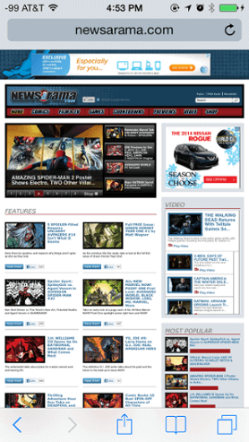

Compare the above image to a screen shot of the LyntonWeb blog on the same iPhone. We launched our brand new website at Inbound this past August utilizing HubSpot’s new content optimization system (COS) that allowed us to build a mobile first website. Which one is easier to read?
Responsive web design is only a few years old so it’s understandable that the entire web isn't built on a responsive platform yet, but it’s time for marketers to be proactive.
Need some convincing?
Saving time and money
Having a responsive site means you have one site, and one site only. No more desktop and mobile sites to manage separately, saving you money on hosting costs, and saving you time when you need to update content on your site.
A better user experience
Just look at those screenshots above and tell me which one looks better as a reader. Which site would you rather visit? If your site is easier to read and navigate your visitors will stay longer, and convert more.
Better for SEO
Google has gone on the record saying they prefer responsive designs for mobile. That should be more than enough convincing.
Still need more? Okay, here’s the clincher.
Users browsing on mobile devices goes up every quarter, but I’m sure you’ve heard that before. However, this past Black Friday mobile sales jumped up 43% from last year. Wow. Having a responsive site makes it easier for your visitors to not only read your site, but also to convert and become customers.
Make sure your site is set up for success. Take a spin around your site on a tablet, or better yet your smartphone. Then contact your friendly neighborhood Inbound Marketers to learn how to bring your convert your site into a responsive one.


You May Also Like