Comparison Table [+ only]
A table for comparing multiple options, with optional CTAs.
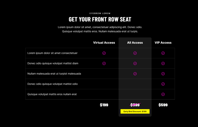
View a live demo of this module.
Content
- Include a heading
- Configure as many columns as you want. In each column, you can edit:
- The column label
- Whether or not to highlight the column with a different background color
- Footer text, which can be scratched out with a graphic, and can include a callout link with a background
- Configure as many rows as you want. In each row, you can edit:
- The row’s label
- The contents of each column, in the same order as they were configured in the Columns field. Each column in the row can be an image, a FontAwesome icon, or text (or blank)
- Configure the accessible text of the first column containing the row labels.
Styles
- Set Light Mode
- Add “scanline” background style
- Change heading alignment
- Change highlighted column color and border radius
- Change the row border style
- Change the “scratch-through” graphic
- Change icon color and height
About This Module
The Comparison Table module is designed specifically for showcasing service packages, pricing plans, feature comparisons, and product differentiators on your HubSpot pages. This module works particularly well for professional services firms presenting service tiers, event organizers displaying ticket options, or B2B companies highlighting product features against competitors.
When adding this module through the HubSpot page editor’s drag-and-drop interface, you’ll find it most effective on landing pages, service pages, and pricing pages where visitors need to make informed decisions between multiple options. The module’s conversion-focused design includes optional CTAs in column footers, making it ideal for driving sign-ups or purchases directly from your comparison.
Pro tip: Use the column highlighting feature to draw attention to your most popular or recommended option — this creates a visual hierarchy that guides visitors toward your preferred choice. The highlighted column’s custom background color can be adjusted in the Styles section to match your brand colors defined in the Brightlane theme settings.
For optimal readability, limit your comparison table to 3-5 columns on desktop. The module is fully responsive, so columns will stack appropriately on mobile devices. When configuring row content, you can mix different content types within the same row — for example, using checkmark icons for feature availability while including descriptive text for pricing details.
The “scanline” background style option adds visual interest without overwhelming your content, while the customizable scratch-through graphics help emphasize outdated pricing or limited-time offers. Remember to configure the accessible text for screen readers to ensure your comparison table remains inclusive for all visitors.