Feature Items
A set of featured items such as benefits, services, etc. Each item can include an icon, text, and call to action.
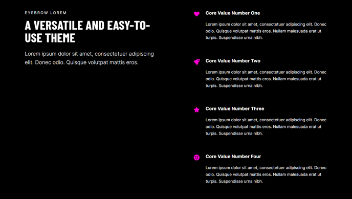
View a live demo of this module.
Content
- Include a heading
- Change how many items to show per row
- Change heading placement (left, top, right)
- Change icon placement (top, right, left, in item heading)
- Use a FontAwesome icon or upload a custom image
Styles
- Set Light Mode
- Change heading alignment
- Change item text alignment
- Change max height of icons
- Change icon color (only applicable to FontAwesome icons)
How to Use This Module
The Feature Items module is designed to showcase your key services, benefits, or value propositions in an organized, scannable format that drives conversions. This module works particularly well on homepage hero sections, service overview pages, and landing pages where you need to quickly communicate multiple value points to visitors.
When adding this module through the HubSpot page editor’s drag-and-drop interface, you’ll find it under the Brightlane theme modules section. The module automatically adapts to your theme’s styling while giving you granular control over layout and appearance through the module settings panel.
Strategic placement recommendations: Position Feature Items modules early on your homepage to highlight core services, or use them on dedicated service pages to break down complex offerings into digestible chunks. The conversion-focused design of the Brightlane theme makes this module particularly effective when paired with call-to-action buttons that guide users to contact forms or service detail pages.
Icon selection best practices: While FontAwesome icons provide consistency and fast loading times, custom uploaded images give you more brand control. Keep custom icons under 100px for optimal performance, and ensure they maintain visual clarity when scaled down on mobile devices.
Layout optimization: The flexible row configuration works best when you align the number of items with your content hierarchy. Three items per row creates strong visual balance for services, while four or more items work well for smaller feature points or benefits. Consider how the heading placement affects the visual flow – left-aligned headings create a more structured feel, while top placement offers better mobile responsiveness.
Test different combinations in the HubSpot preview mode to ensure your Feature Items module maintains visual impact across all device sizes.