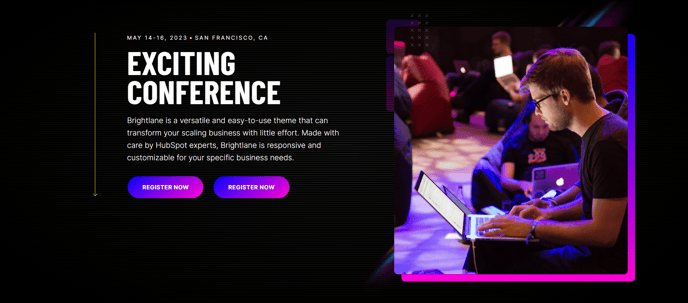
Hero - 2 Columns
Two column hero with options to add text, speakers, and collapsible text to one side and an image, form, or video on the other side.
Note: The section this module is added to should have its Content Alignment set to Full width.
View a live demo of this module.
Content
- Add any number of speaker bios under the text
- Add any number of collapsible text sections under the text
- On media side add image, form, or video
- Change vertical alignment
- Change placement of media on both desktop (left or right) and mobile (top or bottom)
- Add a down arrow with an anchor link
- Add a back arrow [+ only]
Styles
- Set Light Mode
- Add “scanline” background style
- Add background base layer with optional blur effect
- Change background on desktop and mobile (color, gradient, or background)
- Edit module padding
- Add load-in animation to media
- Change text alignment
- Customize list styling
- Customize form styling
- Change play button color and overlay color on video
- Customize social icon styling
Usage Guide
The Hero - 2 Columns module is designed to create impactful above-the-fold sections that immediately capture visitor attention while providing clear pathways to conversion. This module excels on landing pages, event registration pages, and service-focused pages where you need to balance compelling messaging with lead capture or visual storytelling.
When building your hero section, start by selecting your media type based on your conversion goals. Choose forms for direct lead generation, videos for engagement and explanation, or images for visual impact and brand reinforcement. The module’s flexible layout system allows you to test different media placements—position forms on the right for Western reading patterns, or place videos on the left to draw immediate attention.
The speaker bio functionality makes this module particularly valuable for event pages, webinar landing pages, and conference sites. You can showcase multiple presenters or team members without cluttering the hero space, keeping the focus on your primary call-to-action while building credibility through expert positioning.
Collapsible text sections help you include additional details like agenda items, feature lists, or FAQs without overwhelming first-time visitors. This creates a clean initial impression while allowing interested prospects to dive deeper into specifics.
In the HubSpot page editor, remember that this module requires a full-width section to display properly. When dragging the module from your sidebar, ensure you’ve set the section’s Content Alignment to “Full width” in the section settings panel. The module’s responsive controls let you optimize layouts separately for desktop and mobile experiences, ensuring your hero performs well across all devices and maintains conversion effectiveness regardless of how visitors discover your content.