Hero - Feature [+ only]
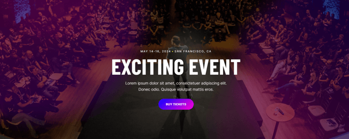
A full-width hero.
Note: The section this module is added to should have its Content Alignment set to Full width.
View a live demo of this module.
Content
- Include heading, text, and calls to action
Styles
- Set Light Mode
- Add “scanline” background style
- Add background base layer that can be optionally blurred
- Change background for both desktop and mobile (color, gradient, background)
- Edit module padding
- Change text alignment
- Customize list styling
- Change heading size
About This Module
The Hero - Feature module serves as a powerful landing element designed to capture visitor attention immediately when they arrive on your site. This full-width hero is particularly effective for professional services firms, event pages, and B2B companies that need to communicate their value proposition quickly and drive conversions from the first page interaction.
When to use this module: Deploy the Hero - Feature on homepage headers, landing pages for marketing campaigns, service pages, or event registration pages where you need maximum visual impact. The module works exceptionally well when you have a strong headline paired with compelling imagery or video backgrounds that support your message.
To add this module to any page, simply drag it from the module library in the HubSpot page editor into your desired section. Remember to configure the section’s Content Alignment to “Full width” in the section settings to ensure the hero displays properly across the entire viewport.
The scanline background style creates a subtle overlay effect that enhances text readability over complex background images without completely obscuring your visuals. This is particularly useful when your background images vary in contrast or color intensity.
Pro tip: Take advantage of the separate desktop and mobile background options to optimize the visual experience across devices. You might use a wide landscape image for desktop and a more focused, portrait-oriented crop for mobile to ensure key visual elements remain visible on smaller screens.
The module’s flexible text alignment options allow you to position your content strategically within the hero space—center alignment works well for broad messaging, while left alignment can create more dynamic, asymmetrical layouts that feel modern and engaging.