Text and Image Columns
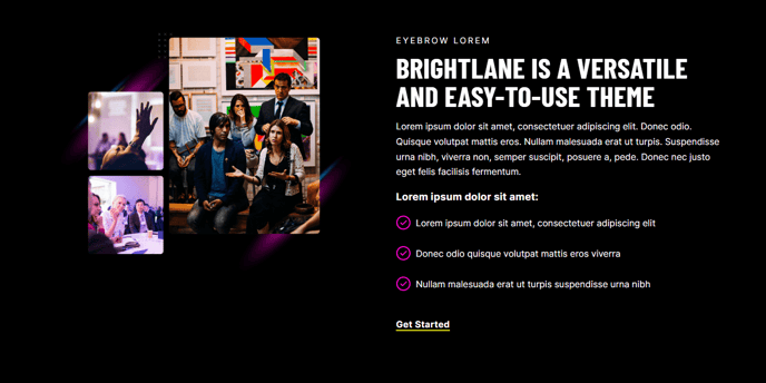
A module you can use to create two columns with text and an image.
View a live demo of this module.
Content
- Change vertical alignment
- Change image placement on both desktop (right or left) and mobile (bottom or top)
Styles
- Add animation to image
- Set Light Mode
- Add “scanline” background style
- Change text alignment
- Customize list styling
How to Use This Module
The Text and Image Columns module is one of Brightlane’s most versatile content blocks, perfect for creating professional service descriptions, team introductions, feature explanations, and product showcases. This module works exceptionally well on landing pages, service pages, and about pages where you need to balance informative content with visual appeal.
When adding this module through the HubSpot page editor’s drag-and-drop interface, you’ll find it particularly effective for breaking up long-form content and creating visual breathing room on your pages. The module automatically adapts to your theme’s typography settings while giving you granular control over layout and presentation.
Best practices for content editors: Use the vertical alignment options to ensure your text and image feel balanced, especially when working with images of varying heights. The mobile image placement controls are crucial for maintaining readability on smaller screens — consider placing images at the bottom on mobile when your text content is lengthy or contains important call-to-action elements.
The animation options work particularly well for case studies and testimonials, drawing attention to key visual elements without overwhelming your visitors. When using the scanline background style, ensure sufficient color contrast with your text content by testing in both light and dark viewing conditions.
This module integrates seamlessly with Brightlane’s global theme settings, inheriting your brand colors and fonts automatically. For B2B companies, this module excels at presenting service offerings with supporting imagery, while event organizers can showcase speakers or venue features effectively. The responsive design ensures your content maintains its professional appearance across all devices, making it ideal for professional services firms targeting decision-makers who browse on various platforms.