Theme Form
A form module with extra options not available in HubSpot's default module.
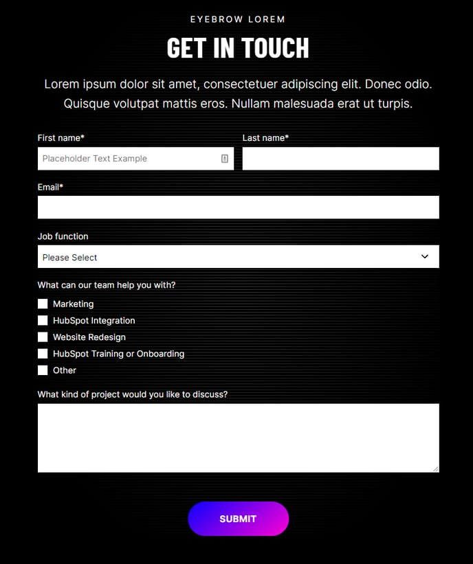
View a live demo of this module.
Content
- Add a heading
- Add a HubSpot form
Styles
- Set Light Mode
- Add “scanline” background style
- Change heading alignment
- Change labels position (left, top, inset)
- Change button position (left, center, right, full width, single field) and color
- Box in the form (edit background, border, gradient shadow, and padding)
How to Use This Module
The Theme Form module is designed to replace HubSpot’s standard form module when you need additional styling flexibility and design control. This enhanced module is particularly valuable for landing pages, contact pages, and service inquiry forms where visual presentation directly impacts conversion rates.
When building pages in the HubSpot page editor, you can drag this module from your theme’s module library onto any flexible page template. The module works exceptionally well on dedicated landing pages, “Contact Us” pages, and promotional pages where form completion is the primary goal.
Key advantages over the default HubSpot form module:
The label positioning options allow you to create more compact forms by placing labels inside form fields (inset) or to the left for a horizontal layout. This flexibility is especially useful when working with limited page width or when matching specific brand guidelines.
The button positioning controls go beyond standard alignment options. The “single field” position places your submit button inline with the last form field, creating a streamlined appearance that works well for simple email signup forms or newsletter subscriptions.
Best practices for implementation:
Enable Light Mode when placing forms over dark backgrounds or colored sections to ensure proper contrast and readability. The scanline background effect adds visual interest without overwhelming your form content, making it ideal for technology or professional service companies.
Use the box styling options to create visual separation on busy pages. Adding a subtle background color or border helps draw attention to your form without requiring additional page elements. The gradient shadow option provides modern depth that aligns well with contemporary B2B design trends.
For optimal conversion rates, consider using full-width button positioning on mobile-focused pages, while center alignment typically performs better on desktop-heavy traffic pages.