Comparison Table [+ only]
A table for comparing multiple options, with optional CTAs.
View a live demo of this section.
Modules
How to Use This Section
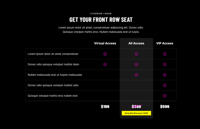
The Comparison Table section creates a structured visual layout that helps your website visitors evaluate different products, services, or pricing plans side-by-side. This section is particularly effective for B2B companies showcasing service tiers, professional services firms comparing package options, or event organizers displaying ticket levels.
You can add this section to any page in your Brightlane theme through HubSpot’s drag-and-drop page editor. Simply navigate to the sections panel and look for the Comparison Table option in your available sections. The section automatically formats your comparison data into clean columns with consistent spacing and typography that matches your theme’s design.
Best practices for content organization: Structure your comparison table with your most popular or recommended option in the center column to draw attention. Include 3-5 key differentiators per row to avoid overwhelming visitors with too much information. The optional CTA buttons work best when they use action-oriented language like “Get Started” or “Choose Plan” rather than generic “Learn More” text.
This section performs exceptionally well on pricing pages, service overview pages, and product comparison landing pages. For professional services websites, consider using it to compare different consulting packages or engagement types. Event websites can leverage this section to highlight different sponsorship levels or ticket packages with clear feature breakdowns.
Customization tip: You can adjust the table’s appearance through the HubSpot page editor’s styling options, including button colors, text alignment, and highlighting specific columns as “recommended” or “popular” choices. The responsive design ensures your comparison table remains readable and functional across all device types.