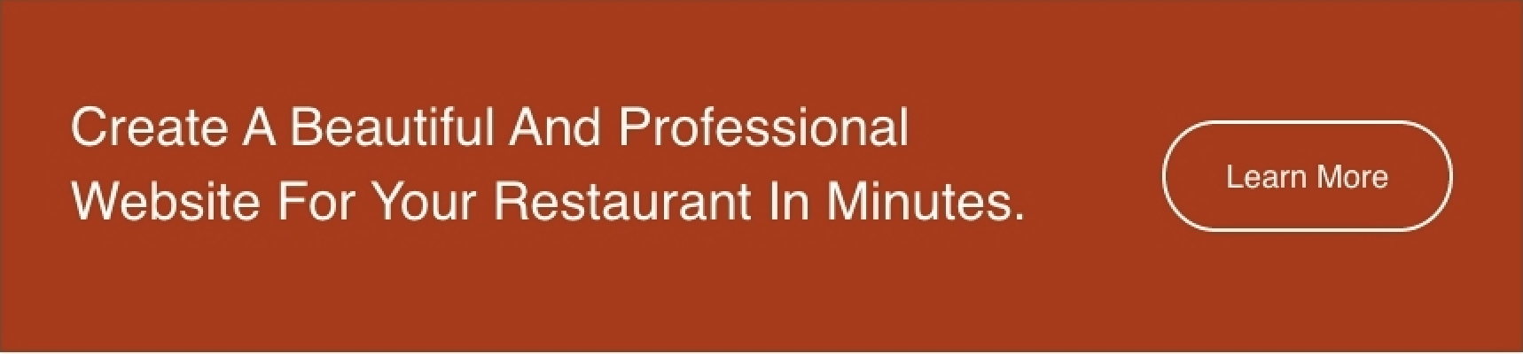
Call to Action Box
A styled box that includes call to action copy and button.
View a live demo of this module.
Content
- Include eyebrow, heading, sub-heading, and text
- Add up to 2 buttons
- Change position of the button(s) to left, right, bottom, or bottom full width
Styles
- Can be set to Dark Mode
- Change the background, border, and padding
- Change the text alignment on both desktop and mobile
Usage Guide
The Call to Action Box module serves as your primary conversion tool for driving customer engagement on restaurant and local business websites. This versatile module works exceptionally well on landing pages, service pages, and homepage sections where you want to capture visitor attention and guide them toward specific actions like making reservations, ordering online, or contacting your business.
When adding this module through HubSpot’s drag-and-drop page editor, you’ll find it particularly effective as a hero section complement or as a strategic conversion point within longer content pages. The dual-button functionality makes it perfect for offering visitors multiple pathways—such as “View Menu” and “Order Now” for restaurants, or “Get Quote” and “Learn More” for service businesses.
Best practices for implementation: Position the module strategically after introducing your value proposition but before overwhelming visitors with too much information. The eyebrow text works well for highlighting special offers or urgency (“Limited Time” or “Now Open”), while the heading should focus on your primary benefit.
The Dark Mode styling option integrates seamlessly with the Bussin theme’s vibrant aesthetic, allowing you to create visual contrast on pages with lighter backgrounds. This is particularly useful when you want the CTA box to stand out dramatically from surrounding content.
For mobile optimization, take advantage of the separate mobile text alignment controls in the module settings. Restaurant websites often benefit from center-aligned text on mobile devices, while service businesses might prefer left-aligned text for a more professional appearance. The bottom full-width button positioning creates maximum impact on mobile screens, making it easier for users to tap and convert on smaller devices.