Hero Section
Single column hero with option to add text with an image, form, video, or animated arrow below it.
Note: The section this module is added to should have its Content Alignment set to Full width.
View a live demo of this module.
Styles
- Can be set to dark mode
- Change max width of content
- Change background for both desktop and mobile (color, gradient, background)
- Edit module padding
- Change text alignment
- Customize list styling
- Set overlap height of media to determine how much of the item hangs over the hero
- Customize form styling
- Change play button color and overlay color of video
How to Use This Module
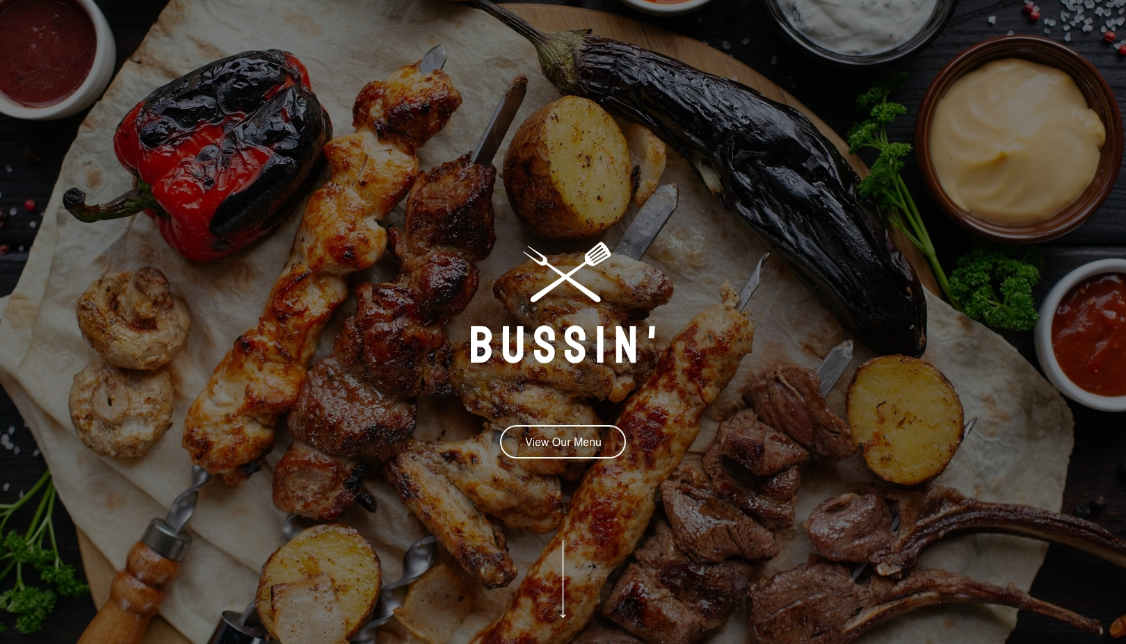
The Hero Section module is designed to make a powerful first impression on your restaurant or local business website. This full-width module works best at the top of your homepage or landing pages where you want to immediately capture visitor attention with compelling visuals and your key message.
When adding this module through the HubSpot page editor, you’ll want to drag it into a section that spans the full width of your page. The module’s flexible media options let you choose what works best for your business – showcase your signature dish with a high-quality image, embed a virtual tour video of your restaurant, or capture leads immediately with an integrated form for reservations or newsletter signups.
Pro tip: The overlap feature is particularly effective for restaurant websites. Set your hero image to overlap into the next section to create visual depth that draws visitors down the page naturally. This works especially well when your next section contains menu items or service descriptions.
For local businesses, consider using the animated arrow option to guide visitors toward your most important content, like your service areas or contact information. The dark mode styling option helps ensure your text remains readable over busy background images, which is crucial when using photos of food or your business location.
The customizable form styling integrates seamlessly with HubSpot’s form builder, so you can maintain your brand consistency while capturing leads. Remember that mobile users will see your mobile background option, so choose images that work well on smaller screens – often this means selecting a cropped or simplified version of your desktop hero image.
This module performs best on homepage templates, service landing pages, and promotional campaign pages where immediate visual impact drives conversions.