Site Header
Main header (sidebar in this theme) for your site. Includes options for call to actions and language switcher.
Note: This module is only available in the Website Header global partial.
View a live demo of this module.
Content
- Logo pulls domain’s default logo, but can be overridden
- Select a HubSpot navigation menu
- Include a utility menu with search, language switcher, and/or buttons
- Select different button styles on mobile and desktop
- Edit strings used within search (results message, search prompt, search toggle, etc)
Styles
Note: Edit the following styles in the Theme Settings under the Website Header section
- Change the sidebar width on desktop
- Customize menu link and child menu link styling
How to Use This Module
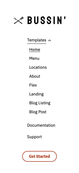
The Site Header module serves as your website’s primary navigation hub and appears as a fixed sidebar throughout your entire site experience in the Bussin theme. Unlike traditional horizontal headers, this sidebar design maximizes vertical space for your content while maintaining easy access to key navigation elements and calls-to-action.
Since this module is restricted to the Website Header global partial, any changes you make will automatically apply across all pages on your site. This ensures consistent branding and navigation without requiring you to update individual pages manually through the HubSpot page editor.
Setting Up Your Header Navigation
When configuring your navigation menu, choose a HubSpot menu that reflects your primary site structure. The sidebar format works particularly well for restaurants and local businesses because it provides ample space to showcase menu categories, location information, and promotional buttons without cluttering your main content areas.
The utility menu options are especially valuable for multi-location businesses or restaurants serving diverse communities. Enable the language switcher if you serve customers who speak different languages, and customize the search functionality strings to match your brand voice - for example, changing “Search” to “Find Your Favorite Dish” for restaurant sites.
Optimizing for Mobile Experience
Pay special attention to the mobile and desktop button style options, as the sidebar transforms into a collapsible menu on smaller screens. Test different button styles to ensure your primary calls-to-action (like “Order Now” or “Make Reservation”) remain prominent and accessible regardless of device.
Remember that sidebar width adjustments in Theme Settings will affect how much horizontal space remains for your main content, so balance navigation prominence with content readability based on your specific business needs.