Case Study Slider
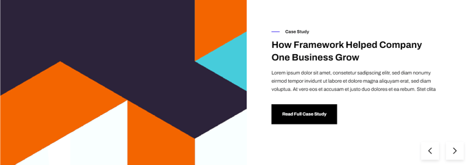
A full width two-column slider of case studies with image in one column and text in the other.
Note: The section this module is added to should have its Content Alignment set to Full width.
View a live demo of this module.
Content
- Add as many slides as you want
- Edit strings used within the slider (next and previous button screen reader text)
Styles
- Set to Dark Mode
- Change the text alignment
- Customize list styling
About This Module
The Case Study Slider is designed to showcase customer success stories and social proof in a visually compelling format that’s perfect for technology and SaaS companies. This module works particularly well on landing pages, product pages, and dedicated case study sections where you want to highlight multiple client testimonials without overwhelming visitors with lengthy text blocks.
When adding this module to your pages in the HubSpot page editor, you’ll find it in the Framework theme’s custom modules section. The two-column layout automatically alternates between left and right positioning as visitors navigate through slides, creating visual interest and preventing monotony. This alternating pattern helps break up content flow while maintaining professional presentation standards.
Best practices for content editors:
The image column should feature high-quality photos of your clients, their products, or relevant business scenes rather than generic stock photos. Screenshots of your software in action or photos from client sites tend to perform better than headshots alone. Keep your case study text concise but specific – include quantifiable results like “increased conversion rates by 45%” rather than vague statements about “improved performance.”
For optimal mobile experience, test your slider content on different screen sizes using HubSpot’s preview functionality. The module automatically stacks columns vertically on smaller screens, so ensure your images remain clear and text stays readable when viewed on mobile devices.
This module pairs exceptionally well with Framework’s clean typography and works seamlessly with the theme’s global color schemes. Consider placing it after your main value proposition content but before detailed feature explanations to maximize social proof impact during the visitor’s decision-making process.