Complex Pricing Comparison [+ only]
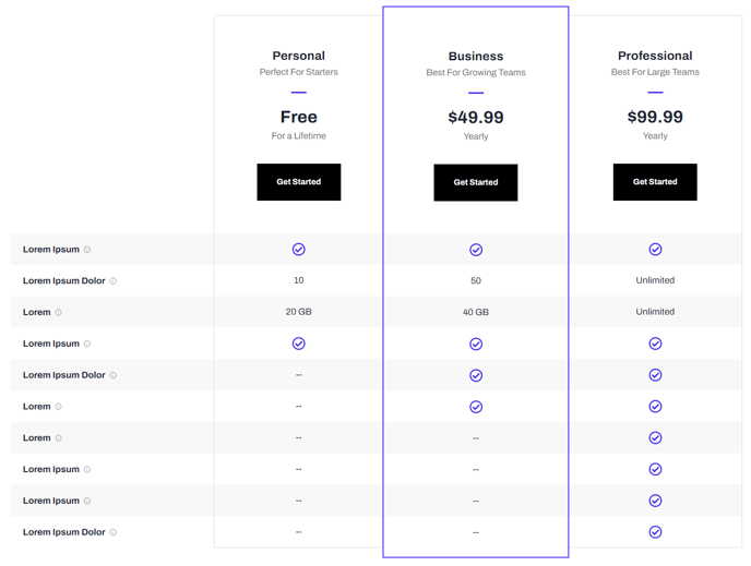
A table comparison of pricing packages and their features.
Note: This module is only available in Framework+, a paid version of Framework.
View a live demo of this module.
Content
- Include a heading
- Add up to three plans with heading, subheading, price, price subheading, and call to action
- Set a plan as featured (adds extra styling to call it out)
- Add any number of features with title, tooltip info, and plan information (icon or text)
Styles
- Set Dark Mode on heading and table separately
- Change text alignment of heading
- Change text alignment of plan header
- Change alternating row background color
- Change border of columns
- Change border of featured columns
- Change icon color
Usage Guide
The Complex Pricing Comparison module is designed specifically for SaaS and technology companies that need to showcase multiple subscription tiers or service packages with detailed feature breakdowns. This module excels when you have complex pricing structures that require side-by-side comparisons to help prospects understand the value differences between plans.
You’ll find this module most effective on dedicated pricing pages, product landing pages, or within service overview sections. Unlike simple pricing cards, this module handles extensive feature lists with tooltips for additional explanations, making it ideal when you need to communicate technical specifications or detailed plan benefits.
When adding this module through the HubSpot page editor’s drag-and-drop interface, start by configuring your three plans in order of value progression. Set your most popular or recommended plan as featured to guide visitor attention with enhanced visual styling. The featured plan styling draws the eye and can significantly improve conversion rates by reducing decision paralysis.
The tooltip functionality is particularly valuable for technical features that need clarification without cluttering the comparison table. Use tooltips to explain acronyms, provide additional context, or clarify feature limitations between tiers.
Styling tip: Take advantage of the separate dark mode controls for the heading and table sections. This flexibility allows you to create visual hierarchy and contrast that aligns with your brand while maintaining readability across different page layouts.
The alternating row background colors and customizable border options help organize complex information, making it easier for visitors to scan across plans and compare specific features. This reduces cognitive load and improves the user experience when evaluating multiple options.
For optimal performance, limit feature rows to essential differentiators that drive purchasing decisions rather than listing every possible feature.