Feature Items
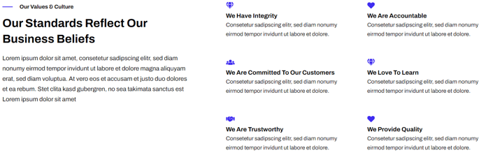
A set of featured items such as benefits, services, etc. Each item can include an icon, text, and a call to action.
View a live demo of this module.
Content
- Change heading placement to top, right, or left of the icons
- Change icon placement to top, right, left, or in the item’s heading
- Change how many items to have per row
- Include a custom or FontAwesome icon
Styles
- Change icon height
- Change FontAwesome icon color
- Change text alignment
- Set Dark Mode
Usage Guide
The Feature Items module is designed to showcase key benefits, services, or product features in a clean, scannable grid layout. This module works exceptionally well on SaaS landing pages, service overview sections, and product feature comparisons where you need to communicate multiple value propositions quickly.
When adding this module through the HubSpot page editor’s drag-and-drop interface, you’ll find it particularly effective on homepage hero sections, dedicated features pages, and above-the-fold content where first impressions matter. The module’s flexible grid system automatically adapts to different screen sizes, ensuring your featured content remains readable on mobile devices.
Content Strategy Tips: Plan your feature items before adding the module to your page. Most effective implementations use 3-6 items to avoid overwhelming visitors. Keep your headings concise (3-5 words) and descriptions to 1-2 sentences for optimal readability. The call-to-action buttons work best when they lead to related landing pages or detailed product information rather than generic contact forms.
Design Considerations: The icon placement options significantly impact your page’s visual hierarchy. Top-aligned icons create a traditional feature grid that works well for product benefits, while left-aligned icons provide a more text-focused layout ideal for service descriptions. When using FontAwesome icons, choose symbols that immediately communicate your feature’s purpose – abstract icons often confuse rather than clarify.
The Dark Mode setting automatically inherits your theme’s global dark mode preferences, but you can override it for individual modules when you need contrast against specific page backgrounds. This is particularly useful on pages with alternating light and dark sections.