Full-Width Two Columns
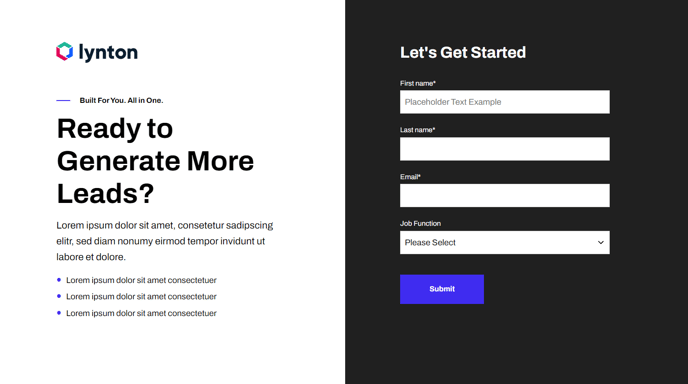
Two columns that span the entire width of a section. Includes text and an image with left or right placement.
Note: The section this module is added to should have its Content Alignment set to Full width.
View a live demo of this module.
Content
- Change the vertical alignment
- Change the media placement on both desktop (left or right) and mobile (top or bottom)
- On the media side include an image, form, or video
- On the text side include a logo, text, and CTA buttons
Styles
- Set Dark Mode
- Edit background color of both sides
- Edit padding
- Change text alignment
- Customize list styling
- Choose load in animation for media
- If using a form—include a heading, box it in, and change button and labels placement
- If using an image—choose to have it fill the entire space
- If using a video—choose to have preview image fill the entire space, change the play button color, and change overlay color
How to Use This Module
The Full-Width Two Columns module is designed for creating impactful hero sections, feature showcases, and content blocks that need maximum visual presence on your pages. Unlike standard two-column layouts that respect page margins, this module utilizes the entire browser width, making it perfect for SaaS landing pages, product announcements, and promotional sections where you want to capture immediate attention.
When adding this module to your page in the HubSpot page editor, ensure the containing section is configured with Full width content alignment—otherwise the module won’t achieve its intended edge-to-edge appearance. This module works exceptionally well on homepage templates, product pages, and dedicated landing pages where visual impact is crucial.
The flexible media options make this module particularly versatile for different content strategies. Use the image option for product screenshots or team photos, the form option to create inline lead capture sections, or the video option for product demos and testimonials. The vertical alignment controls help you maintain visual balance regardless of content length differences between your text and media sides.
For optimal mobile experience, take advantage of the mobile-specific media placement controls. While your desktop layout might feature an image on the right side, you can independently set the mobile version to display the image at the top, ensuring content hierarchy remains logical on smaller screens.
Pro tip: When using this module for SaaS product features, consider enabling the Dark Mode setting and pairing it with contrasting background colors to create distinctive sections that guide visitors through your product story. The animation options add subtle engagement without overwhelming your core message.