Hero - Contact
A hero including location and contact information.
Note: The section this module is added to should have its Content Alignment set to Full width.
View a live demo of this module.
Content
- Change the vertical alignment
- Change the media placement on both desktop (left or right) and mobile (top or bottom)
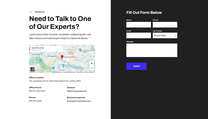
- On the media side include an image, form, or video
- On the text side include regular text, an image or embedded map, and columned information
Styles
- Set Dark Mode
- Edit background color of both sides
- Edit padding
- Change text alignment
- Customize list styling
- Choose load in animation for media
- If using a form, include a heading, box it in, and change button and labels placement
- If using an image, choose to have it fill the entire space
- If using a video, choose to have preview image fill the entire space, change the play button color, and change overlay color
Usage Guide
The Hero - Contact module serves as an ideal conversion-focused header section for your contact pages, service areas, and location-specific landing pages. This dual-purpose layout allows you to present essential contact information alongside engaging visual content, making it particularly effective for SaaS companies showcasing local presence or technology businesses highlighting multiple office locations.
When adding this module through the HubSpot page editor, you’ll find it works exceptionally well on Contact Us pages, About pages with team locations, and service-specific landing pages where you want to immediately present contact options. The module’s split-screen design ensures your contact information receives equal visual weight with your media content, unlike traditional hero sections that prioritize imagery over actionable content.
Pro tip: Use the embedded map option on the text side when showcasing physical locations, and pair it with a contact form on the media side to create a comprehensive contact experience. This combination works particularly well for businesses with multiple locations or service areas.
The vertical alignment controls become crucial when your content lengths vary between the two sides. If you’re including detailed contact information with multiple office locations, set the alignment to top to maintain clean visual hierarchy. For shorter content, center alignment creates better balance.
Take advantage of the columned information feature to organize different types of contact details—separate columns for phone, email, and physical addresses create scannable, professional layouts. The dark mode option proves especially valuable when you want this module to stand out against lighter page sections or when matching your brand’s technology-forward aesthetic.
Remember to preview your module on mobile devices, as the media placement controls significantly impact the mobile user experience and conversion potential.