Resource Grid [+ only]
A grid of resources with editable column sizes.
Note: This module is only available in Framework+, a paid version of Framework.
View a live demo of this module.
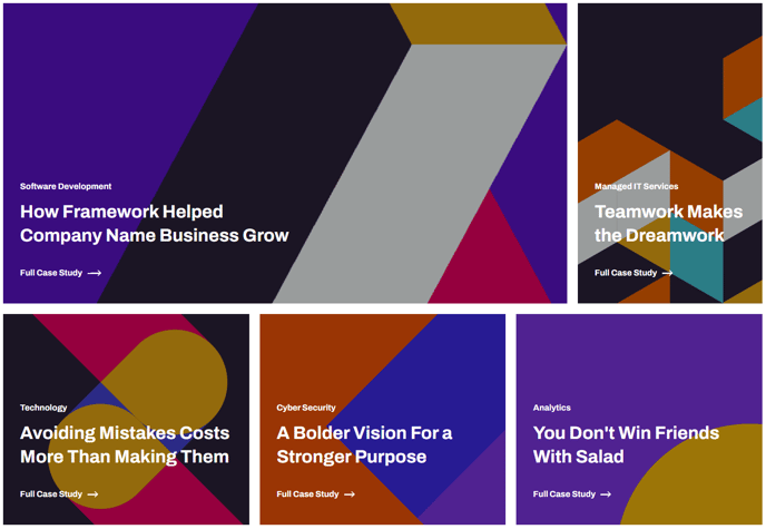
Content
- Include a heading
- Add any number of resources
- Specify the column width for each resource. A row is equal to 12. When added resources reach a total of 12 in width a new row will be started.
- Specify a minimum height for each resource. Every resource in a row will adjust to the highest height column in that row.
- Add an image, text, and call to action to each resource
Styles
- Set dark mode, text alignment, and max width on the heading
- Adjust spacing between columns/rows
- Set dark mode and text alignment on resource text
How to Use This Module
The Resource Grid module is designed specifically for SaaS and technology companies who need to showcase multiple pieces of content—such as whitepapers, case studies, ebooks, or blog posts—in an organized, visually appealing layout. You’ll find this module particularly useful on resource center pages, landing pages, and service-specific pages where you want to highlight related materials.
When adding the Resource Grid to your page through the HubSpot drag-and-drop page editor, you have complete control over the visual hierarchy of your content. The 12-column grid system allows you to create varied layouts—for example, you might feature one primary resource taking up 8 columns alongside two smaller resources at 2 columns each, or create a uniform grid with three 4-column resources per row.
The minimum height setting ensures your grid maintains a polished appearance even when your resource descriptions vary in length. This is especially valuable when mixing different content types, such as brief product overviews alongside detailed case studies.
For optimal user experience, consider grouping related resources together and using consistent image dimensions across your grid items. The call-to-action functionality works seamlessly with HubSpot’s tracking capabilities, so you can monitor which resources generate the most engagement from your visitors.
This module integrates with Framework’s dark mode functionality, making it perfect for technology companies who want to offer their users a modern browsing experience. The responsive design automatically adjusts column layouts on mobile devices, ensuring your resource grid looks professional across all screen sizes without requiring additional configuration in the page editor.