Tabbed Content
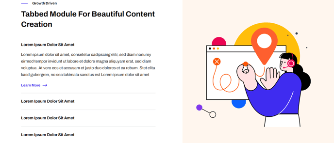
Images that can be clicked through using a tab list of captions.
Note: The section this module is added to should have its Content Alignment set to Full width.
View a live demo of this module.
Content
- Include heading
- Choose to have image fill its entire container
Styles
- Set Dark Mode
- Change heading alignment
- Change text alignment
- Customize list styling
- Change background color of image side
Usage Guide
The Tabbed Content module transforms static image galleries into interactive experiences, making it perfect for showcasing product features, case studies, or step-by-step processes. This module works particularly well on landing pages, product pages, and service overview pages where you need to present multiple concepts without overwhelming visitors with visual clutter.
When adding this module through the HubSpot page editor, you’ll first need to ensure your section container is configured properly. The Full width content alignment requirement allows the tabbed interface to utilize maximum screen real estate, preventing cramped layouts that could harm user experience on larger displays.
Content Strategy Tips: Use the optional heading to provide context for your tabbed content series. The image fill option works best when your images share consistent dimensions and visual styling. Consider using this module to replace traditional image carousels, as tabs give users more control over their browsing experience and improve accessibility.
Design Considerations: The Framework theme’s clean aesthetic shines through this module’s minimal tab styling. Dark mode functionality automatically adjusts tab colors and text contrast based on your theme settings. When customizing background colors for the image side, ensure sufficient contrast with your tab navigation for optimal readability.
Page Performance: Since this module loads all tab content simultaneously, limit yourself to 5-7 tabs maximum to maintain fast page speeds. This approach also improves SEO since all your content remains crawlable by search engines, unlike some JavaScript-heavy alternatives.
The module integrates seamlessly with Framework’s responsive design system, automatically stacking tabs vertically on mobile devices while maintaining the side-by-side desktop layout that makes this component so effective for feature comparisons and product demonstrations.