Call to Action Banner
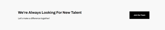
Full-width section, with a medium light background, calling out text and call to action button.
View a live demo of this section.
Modules:
How to Use This Section
The Call to Action Banner section provides a prominent, full-width focal point designed to drive conversions on your HubSpot pages. This section works particularly well on landing pages, service pages, and at the bottom of blog posts where you want to guide visitors toward a specific action like scheduling a demo, downloading a resource, or starting a free trial.
When you add this section through the HubSpot page editor’s drag-and-drop interface, you’ll notice it automatically spans the entire width of your page with a subtle light background that creates visual separation from surrounding content. This design choice helps the call-to-action stand out without overwhelming your page’s visual hierarchy.
The section’s medium light background setting ensures sufficient contrast for readability while maintaining the Framework theme’s clean, professional aesthetic that SaaS and technology companies need. You can customize the background color through the section’s style options in the page editor if your brand requires different treatment.
Best practices for this section:
- Place it strategically where users have consumed enough content to make an informed decision
- Keep your call-to-action text concise and action-oriented (“Get Started,” “Schedule Demo,” “Download Now”)
- Use contrasting button colors that align with your brand’s primary CTA styling
- Test different headline variations to see what resonates with your audience
The section integrates seamlessly with HubSpot’s contact forms, meeting scheduling tools, and tracking capabilities, making it easy to measure conversion performance. Since it’s built on the Framework theme’s modular system, you can duplicate this section across multiple pages while maintaining consistent styling, then customize the messaging for each page’s specific conversion goal.