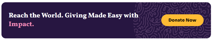
Call to Action Box
A styled box that includes call to action text and button.
View a live demo of this module.
Content
- Add up to 2 buttons
- Change position of the button (left, right, bottom, bottom full width)
Styles
- Change the background, border, and padding
- Change the text alignment on both desktop and mobile
- Set to Dark Mode
How to Use This Module
The Call to Action Box module serves as a powerful conversion tool for nonprofit and education organizations using the Impact theme. You can add this module to any page through HubSpot’s drag-and-drop page editor, making it ideal for donation campaigns, volunteer recruitment, event registration, and program enrollment pages.
This module works particularly well on landing pages, campaign pages, and key sections of your homepage where you need to drive specific actions. The flexible button positioning options allow you to create layouts that complement your page design – use left or right positioning when you have supporting images or content alongside the CTA, or choose bottom positioning for a more traditional centered approach.
Design Best Practices
When configuring the module in the page editor, consider your content hierarchy. The bold typography characteristic of the Impact theme means your CTA text will naturally draw attention, so keep your messaging concise and action-oriented. The Dark Mode option is especially effective when you want to create visual contrast against lighter page sections or when matching your organization’s brand colors.
For nonprofits, this module excels at creating urgent donation appeals or volunteer sign-ups. Education organizations can leverage the dual-button functionality to offer multiple pathways – such as “Apply Now” and “Schedule a Tour” – giving visitors options while maintaining focus.
Integration Tips
The module inherits styling from your theme settings, ensuring consistency across your site. You can customize the background and border options to align with your brand while maintaining the Impact theme’s visual cohesion. Test different padding settings to ensure your CTA boxes maintain proper spacing on both desktop and mobile devices, as the responsive text alignment options help optimize the user experience across all screen sizes.