Full Width Two Columns
Two columns that span the entire width of a section.
Note: The section this module is added to should have its Content Alignment set to Full width.
View a live demo of this module.
Content
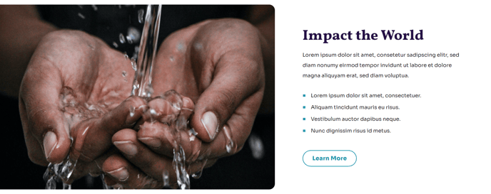
- Change the image placement on both desktop (left or right) and mobile (top or bottom)
- On the text side include text and CTA buttons
Styles
- Set Dark Mode
- Edit background color
- Change text alignment
- Split lists into two columns
- Customize list styling
- Edit padding
About This Module
The Full Width Two Columns module is designed to create impactful content layouts that maximize your page’s horizontal space. This module works particularly well for nonprofits and educational organizations that need to showcase compelling imagery alongside detailed program information, success stories, or mission statements.
When you drag this module into the HubSpot page editor, you’ll notice it requires the section’s Content Alignment to be set to Full width to function properly. This ensures the two-column layout extends to the edges of your browser window, creating the visual impact the Impact theme is known for. You can access this setting in the section’s style options within the page editor.
Best use cases include pairing large hero images with program descriptions, creating before-and-after comparisons, showcasing testimonials with donor photos, or highlighting statistics alongside supporting visuals. The module’s responsive image placement options make it particularly valuable for mobile optimization—you can position images at the top on mobile devices while keeping them left or right-aligned on desktop.
The Dark Mode style option is especially useful when you want this section to stand out from surrounding content blocks. Combined with the customizable background colors, you can create visual hierarchy that guides visitors through your page content effectively.
Pro tip: When using multiple CTA buttons in the text column, consider your button hierarchy. The Impact theme’s styling will help differentiate primary from secondary actions, but limit yourself to two buttons maximum to avoid overwhelming visitors. This module pairs exceptionally well with the theme’s other full-width modules to create cohesive, magazine-style layouts that engage your audience and drive conversions.