Hero - One Column
Single column hero with option to add text with an image, form, or video below it.
Note: The section this module is added to should have its Content Alignment set to Full width.
View a live demo of this module.
Styles
- Set Dark Mode
- Change max width of content
- Change background for both desktop and mobile (color, gradient, background)
- Edit module padding
- Change text alignment
- Customize list styling
- Set overlap height of media to determine how much of the item hangs over the hero
- Change load-in animation of media
- Customize form styling
- Change play button color and overlay color of video
Usage Guide
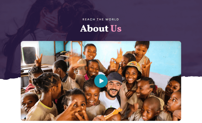
The Hero - One Column module is designed as your primary page header, perfect for creating impactful first impressions on your nonprofit or education website. You’ll typically place this module at the top of your homepage, landing pages, campaign pages, or major section pages where you need to immediately communicate your mission and engage visitors.
When adding this module through HubSpot’s drag-and-drop page editor, you’ll want to create a new section first and ensure it’s set to full width in the section settings. This allows the hero to span the entire browser width for maximum visual impact. The single-column layout works particularly well when you have one clear message or call-to-action, rather than competing elements.
Choose your media wisely based on your page goals. Add an image when showcasing your cause or programs, embed a form for donation or volunteer sign-ups, or include a video to tell your organization’s story. The overlap height setting is especially powerful — it allows your media to extend beyond the hero section, creating dynamic visual layers that draw the eye downward to your page content.
For nonprofit campaigns, consider using dark mode with white text over compelling imagery of your work. Educational institutions might showcase campus life with the video option and use the text area for enrollment messaging. The customizable form styling integrates seamlessly with HubSpot’s form builder, so you can match your brand colors and maintain consistent styling.
Remember that this hero appears above the fold on most devices, so your text should immediately convey your value proposition. The bold typography styling built into the Impact theme ensures readability even over background images, but always test your contrast ratios for accessibility compliance.