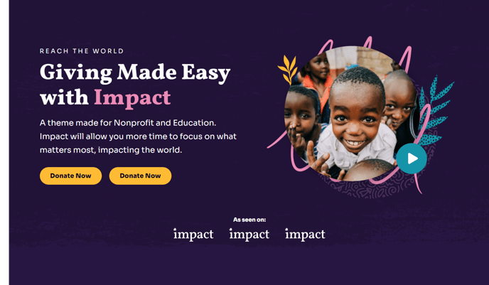
Hero - Two Column
Two column hero with options to add text and logos to one side and an image, form, or video on the other side.
Note: The section this module is added to should have its Content Alignment set to Full width.
View a live demo of this module.
Content
- Change the vertical alignment
- Change the media placement on both desktop (left or right) and mobile (top or bottom)
- On the media side include an image, form, or video
- Add logos below main content
- Choose how many logos to show at a time (if number is larger than the number of uploaded logos the module will become a slider)
- Add a down arrow
Styles
- Set Dark Mode
- Edit background and padding
- Change text alignment
- Customize list styling
- Choose load in animation for media
- If using a form—include a heading, box it in, and change button and labels placement
- If using a video—change the play button color and change overlay color
- Change max height of logos on both desktop and mobile
Usage Guide
The Hero - Two Column module serves as an ideal introduction to your nonprofit or educational organization’s homepage, campaign pages, or program landing pages. This versatile module excels at presenting your mission statement or key message alongside compelling visual content that drives engagement.
When building pages in the HubSpot page editor, drag this module into a section configured for full-width display to achieve the intended visual impact. The two-column layout automatically adapts to mobile devices, stacking content vertically for optimal readability on smaller screens.
Choose the media type that best supports your content strategy. Use high-quality images to showcase your organization’s work in action, embed donation or contact forms to capture leads directly in the hero area, or include videos that tell your story more dynamically. The video option includes customizable overlay colors and play button styling that maintain consistency with your brand.
Logo placement below your main content works particularly well for displaying partner organizations, sponsors, or certifications. The automatic slider functionality ensures clean presentation even when showcasing numerous partnerships. For educational institutions, consider featuring accreditation logos or industry partnership badges.
Dark mode capability makes this module especially effective for creating dramatic first impressions or highlighting urgent campaign messaging. The load-in animation options help draw attention to your media content without overwhelming visitors.
This module pairs effectively with the Impact theme’s other content modules on longer landing pages, allowing you to maintain visual hierarchy while providing comprehensive information about your programs or initiatives. The customizable padding and background options ensure seamless integration with your overall page design strategy.