Theme Buttons
Custom call to action buttons.
View a live demo of this module.
Module
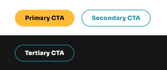
- Choose what style to display button with (styles are set in the Theme Settings in the Buttons section)
- Include an icon (not applicable to link style buttons)
- Choose to open a video modal instead of a link
- Change the alignment of the button on the page
Usage Guide
The Theme Buttons module serves as a versatile call-to-action tool that helps drive engagement and conversions across your nonprofit or educational organization’s website. You can drag and drop this module onto any HubSpot page template to create compelling action points that guide visitors toward your most important goals, whether that’s making donations, signing up for programs, or accessing resources.
This module works particularly well on landing pages, homepage hero sections, and donation pages where you need prominent calls-to-action that stand out from your content. The Impact theme’s button styles are designed to complement the bold typography aesthetic while maintaining accessibility standards for educational and nonprofit audiences.
Best practices for implementation: Place Theme Buttons strategically after compelling content blocks or at natural decision points in your page flow. For donation-focused pages, consider using the primary button style with action-oriented text like “Donate Now” or “Support Our Mission.” Educational organizations can leverage the secondary styles for course registration or resource downloads.
The video modal functionality is particularly valuable for impact storytelling and program showcases. Instead of linking to external video platforms, you can embed testimonials, program overviews, or mission videos directly within your page experience, keeping visitors engaged without navigation disruption.
Alignment considerations: Center alignment works best for hero sections and standalone CTAs, while left alignment integrates seamlessly within content blocks alongside text modules. Right alignment can create visual balance when paired with left-aligned content or images.
Remember to configure your button styles in Theme Settings before adding multiple button modules across your site. This ensures visual consistency and makes future design updates easier to implement across all your pages.