Call to Action
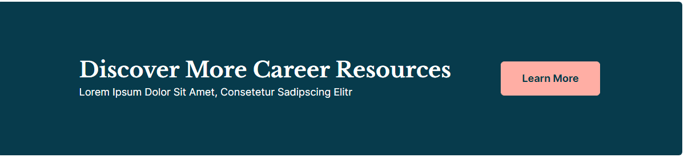
A callout with text and buttons for users to take action on.
**
 **
**
View a live demo of this module.
The following is a detailed listing of all the Content and Style fields available in this module.
Content
- Text _[Common Module Fields]
_ - Buttons [Common Module Fields]
- Layout [Group]
- Desktop, Tablet, Mobile [Responsive Groups]
- Button Position _[Choice]
_Choose where to position the button in the call to action
Choices: Left, Right, Bottom - Spacing _[Number]
_Change the spacing between the text and the button(s)
- Button Position _[Choice]
- Desktop, Tablet, Mobile [Responsive Groups]
- Advanced [Common Module Fields]
Styles
- Dark Mode _[Boolean]
_Check to use dark mode colors in the module - Module [Common Module Fields]
- Text Alignment _[Group]
_Change the alignment of the text in module on desktop, tablet, and mobile - Eyebrow [Group]
- Font Styles [Common Module Fields]
- Heading [Group]
- Font Styles [Common Module Fields]
- Subheading [Group]
- Font Styles [Common Module Fields]
- Text [Group]
- Font Styles [Common Module Fields]
- Lists [Group]
- List Styles [Common Module Fields]
How to Use This Module
The Call to Action module is one of the most versatile conversion-focused components in the Rubric theme, designed to capture your visitors’ attention and guide them toward specific actions. You’ll find this module particularly effective on landing pages, at the end of blog posts, or strategically placed throughout longer content pages where you want to break up text with actionable elements.
When adding this module through HubSpot’s drag-and-drop page editor, you can create everything from simple newsletter signups to complex multi-button layouts that drive users to different resources or contact forms. The module’s responsive layout controls are especially valuable for education institutions and event organizers who need their calls to action to work seamlessly across all devices.
Best practices for implementation: Position your primary call to action above the fold on landing pages, and use secondary CTAs lower on the page to capture visitors who need more information before converting. The button positioning options (left, right, bottom) allow you to create visual hierarchy that complements your page’s content flow. For educational content, try placing the buttons at the bottom to let users read through your information first.
The dark mode toggle is particularly useful when you’re placing this module over background images or within sections that use darker color schemes. This ensures your text remains readable while maintaining the visual consistency that makes Rubric ideal for professional institutional websites.
Consider using multiple Call to Action modules with different messaging throughout longer pages – for example, a “Learn More” CTA early in the content and a “Contact Us” CTA at the bottom. The spacing controls help you fine-tune the visual balance between your text content and action buttons.