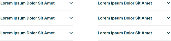
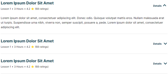
Collapsible Content
A set of sections with content that the user can click to reveal.
Example 1**
 **
**
 **
**View a live demo of this module.
The following is a detailed listing of all the Content and Style fields available in this module.
Content
- Dropdown Label _[Text]
_Add a label to the dropdown arrow of each item - Items [Repeater Group]
- Open by default _[Boolean]
_Have collapsible content of this item open on load - Title [Text]
- Tags _[Repeater Text]
_Add a horizontal list of items underneath the title - Text [Common Module Fields]
- Open by default _[Boolean]
- Include FAQ Schema? _[Boolean]
_If checked, the module will be used for schema.org FAQ markup. This should only be checked on one FAQ module per page. - Layout [Group]
- Divider symbol between tags _[Choice]
_Choices: None, Slash, Vertical Bar, Bullet, Caret - Desktop, Tablet, Mobile [Responsive Groups]
- Columns _[Number]
_Number of columns to split items into - Columns Spacing _[Number]
_Spacing between columns
- Columns _[Number]
- Divider symbol between tags _[Choice]
- Advanced [Group]
Styles
-
Dark Mode _[Boolean]
_Check to use Dark Mode colors set in the Theme Settings -
Module [Group]
- Module Styles [Common Module Fields]
-
Summary [Group]
- Border [Group]
- Remove top most border [Boolean]
- Remove bottom most border [Boolean]
- Border _[Border]
_Change the style, color, and width of borders
- Title [Group]
- Font Styles [Common Module Fields]
- Dropdown [Group]
- Arrow Size [Number]
- Arrow Color [Color]
- Label [Group]
- Font Styles [Common Module Fields]
- Tags [Group]
- Font Styles [Common Module Fields]
- Border [Group]
-
Content [Group]
- Text Alignment
- Desktop, Tablet, Mobile [Responsive Alignment]
- Eyebrow [Group]
- Font Styles [Common Module Fields]
- Heading [Group]
- Font Styles [Common Module Fields]
- Subheading [Group]
- Font Styles [Common Module Fields]
- Text [Group]
- Font Styles [Common Module Fields]
- Text Alignment
-
- Lists [Group]
- List Styles [Common Module Fields]
- Lists [Group]