Listed Resources
List of contained content for resources such as blog posts, events, courses, etc., with multiple different style options.
**Example 1
**
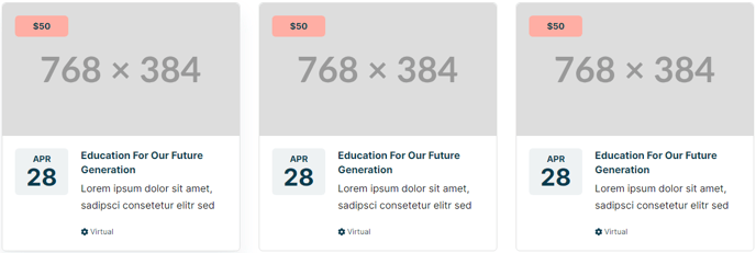
**
Example 2
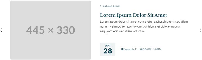
**
**Example 3
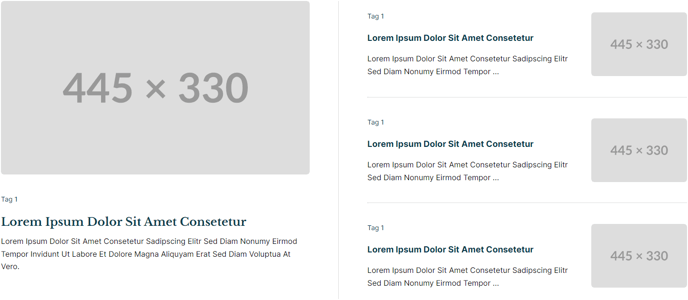 **
**
**Example 4 & 5
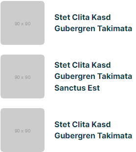
 **
**
View a live demo of this module.
The following is a detailed listing of all the Content and Style fields available in this module.
Content
-
Style _[Choice] [ Required]
_Select how the items should be displayed.Choices: List, Grid, Featured, Slider -
Data Source [Choice] [Required]
Select where the data should be pulled from.
Choices: Manual, Blog, HubDB, CRM Objects -
Blog Posts [Group]
- Post Type [Choice] [Required]
Listing can only be used on a Blog Listing page. All other types are limited to displaying 250 posts.
Choices: Recent, Related, Popular, Listing - Navigation Type [Choice] [Required]
If Post Type is set to Listing. To change the number of posts to show at a time, change the Number of posts per listing page in the Templates tab of your portal blog settings.
Choices: None, Infinite Load, Infinite Scroll - Load Button Style _[Choice] [Required]
_If Post Type is set to Listing and Navigation Type is not None.
Choices: Primary, Secondary, Tertiary, Quaternary, Text Link, Text Link (Dark) - Blog _[Blog]
_Leave blank to use the default blog or blog that this module appears in. - Blog Post Override _[Repeater Text]
_If Post Type is set to Related, enter the ID of a blog post that should always show, despite all other parameter values and filters. - Relevant Blog Posts _[Repeater Text]
_If Post Type is set to Related, enter the ID of a blog post to use when finding relevant blog posts. This parameter should only be used when the module is appearing on a page. On blog posts, it will default to the post the module is appearing on. - Include [Choice]
Data to display
Choices: Thumbnail, Date, Author, Tags, Read Time, Summary - Strings _[Group]
_If Post Type is set to Listing and Navigation Type is not None- Load Button Text [Text] [Required]
- Loading Message [Text]
This text is what screen readers will hear while posts are loading. Visually a dot loader will display. - End of Content Message _[Text] [Required]_Message that appears when user has reach the end of the content.
- Error Message _[Text] [Required]
_Message that appears if there is a problem loading the posts.
- Post Type [Choice] [Required]
-
- Query [Group]
- Limit _[Number] [Required]
_Number of posts to pull in. - Time Frame _[Choice] [Required]
_If Post Type is set to Popular, set time from of the analytics.
Choices: All Time, Past Year, Past Six Months, Past Month - Query By: _[Choice] [Required]
_Filter the posts that are pulled in.
Choices: None, Tags, Author - Tags [Repeater Tag]
- Tag Logic Operator _[Choice]
_Choose whether posts selected must contain all tags (AND) or any tag (OR). - Author _[Text]
_If Post Type is set to Recent, enter the slug of a blog author to filter posts by. - Authors _[Repeater Text]
_If Post Type is set to Related, enter the display name of a blog author to query posts by. - Start Date _[Date]
_If Post Type is set to Related, query posts published after this date. - End Date _[Date]
_If Post Type is set to Related, query posts published before this date.
- Limit _[Number] [Required]
- Query [Group]
-
HubDB [Group]
If Data Source is set to HubDB, in the provided fields add the column names from your table that you want to map to.- Table _[HubDB Table]
_Table to pull data from. - Thumbnail [Text]
Must map to an Image column. - Date _[Text]
_Must map to a Date or Date and time column. - Eyebrow _[Text]
_Must map to a Text column. - Title [Text]
Must map to a Text column. - Summary _[Text]
_Must map to a Text column. - Pill Tags _[Group]
_If Style is set to Grid or Slider- Tag _[Text]
_Must map to a Text, Select, or Multi-select column. - Color Setting [Choice] [Required]
Choose how to color the pill tags. Set to a single color OR choose a selection of colors to alternate through per card or per tag (only for multi-select columns).
Choices: Single, Alternate by Card, Alternate by Tag - Color _[Color]
_If Color Setting is set to Single. - Color [Repeater Color]
If Color Setting is set to Alternate by Card or Alternate by Tag
- Tag _[Text]
- Text Tags [Group]
- Icon [Common Module Fields]
- Tag _[Text]
_Must map to a Text, Select, or Multi-select column
- Link [Link]
Must map to a URL or Text column
- Table _[HubDB Table]
-
Manual _[Group]
_If Data Source is set to Manual- Thumbnail [Image]
- Date [Date]
- Eyebrow [Text]
- Title [Text]
- Summary [Text]
- Pill Tags _[Repeater Group]
_If Style is set to Grid or Slider- Tag [Text]
- Color [Color]
- Text Tags [Repeater Group]
- Icon [Common Module Fields]
- Tag [Text]
- Link [Link]
-
CRM Objects _[Group]
_If Data Source is set to CRM Objects, use this group’s fields to map columns to the appropriate data type.-
CRM Object Source _[Choice]
_Choose the CRM Object to pull from. Note: All but Product, Marketing Event, and Custom can only be used on pages that require either a password or a membership login.
Choices: Product, Marketing Event, Custom, Contact, Company, Deal, Ticket, Quote, Line Item. -
Custom Object Name _[Text]
_If Custom is selected in CRM Object Source, enter the internal name of your custom object. -
Thumbnail [Text]
Must map to a property containing and image URL. -
Date _[Text]
_Must map to a Date or Date and Time picker property. -
Eyebrow _[Text]
_Must map to a Text/Values input type, select, or single checkbox property. -
Title _[Text]
_Must map to a Text/Values input type, select, or single checkbox property. -
Summary [Text]
Must map to a Text/Values input type, select, or single checkbox property. -
Pill Tags [Repeater Group]
(If List Style is set to Detailed these tags will be styled as Text Tags)- Tag _[Text]
_Must map to a Text/Values input type, select, or checkbox property. - Color Setting _[Choice]
_Choose how to color the pills tag. Set to a single color OR choose a selection of colors to alternate through per card or per tag (only for multi-select columns).
Choices: Single, Alternate by Card, Alternate by Tag - Color [Color]
- Tag _[Text]
-
-
- Text Tags
- Icon [Flattened Group]
- Tag _[Text]
_Must map to a Text/Values input type, select, or checkbox property.
- Link _[Text]
_Must map to a property containing a URL.
- Text Tags
-
Query _[Group]
_If HubDB or CRM Objects is selected in Data Source.- Limit _[Number]
_If you have multiple resource modules pulling CRM Objects on the same page only 1000 can be called in total on the page across all modes. This is a HubSpot limitation. - Order By _[Text]
_Set the column/property to order by. - Reverse Order _[Boolean]
_If Order By is set, choose to reverse the order. - Filter _[Group]
_Filter the results by a specific value.- Column/Property _[Text]
_The name of the column/property to filter by. - Query Type _[Choice]
_Choose the type of query to apply. Note: Some query types are only applicable to certain column/property types.
Choices: EQUAL, NOT EQUAL, GREATER THAN, LESS THAN, GREATER THAN OR EQUAL, LESS THAN OR EQUAL, CONTAINS, IS NULL, NOT NULL, IN, NOT IN - Value [Text]
- Column/Property _[Text]
- Limit _[Number]
-
Layout [Group]
- Add Divider _[Boolean]
_If Style is set to List. - Text Tags Position _[Choice]
_Choices: Top of Content, Bottom of Content - Date Position _[Choice]
_If Style is set to Grid or Slider, on smaller screens “left/right of content” will move the date into a single box above/below the text content.
Choices: Left on Content, Right of Content, Right of Tags, Left of Tags, In Tags - Slider _[Common Modules Fields]
_If Style is set to Slider - Desktop, Tablet, Mobile [Responsive Groups]
- Thumbnail Position (Main) _[Choice]
_If Style is set to Featured, position of the thumbnail in the first featured item.
Choices: Top, Right, Bottom, Left, Hide - Thumbnail Position _[Choice]
_Choices: Top, Right, Bottom, Left, Hide
- Thumbnail Position (Main) _[Choice]
- Add Divider _[Boolean]
-
-
- Spacing Between Image and Text [Number]
- Grid [Common Module Fields]
-
-
Strings [Group]
- Read Time Text [Text] [Required]
Use % to indicate where the dynamically generated number should be placed within the text. - Truncate Summary [Text]
Cut off text after a certain number of characters. Leave blank to display entire text. - Date Format _[Text] [Required]
_Must be a pattern following Unicode LDML. - Month Format _[Text] [Required]_Must be a pattern following Unicode LDML.
- Day Format _[Text] [Required]_Must be a pattern following Unicode LDML.
- Read Time Text [Text] [Required]
-
Slider Strings _[Group]
_If Style is set to Slider- Slider Label [Text] [Required]
This element does not display visually. - Previous Arrow Label _[Text] [Required]
_This element does not display visually. - Next Arrow Label [Text] [Required]
This element does not display visually. - First Arrow Label [Text] [Required]
Aria label for the prev/next button when navigating to the first slide. This element does not display visually. - Last Arrow Label _[Text] [Required]
_Aria label for the prev/next button when navigating to the last slide. This element does not display visually. - Slide Pagination Label [Text] [Required]
This element does not display visually. - Slide Pagination Dot Label [Text] [Required]
Use %s to dictate where to input the slide number. This element does not display visually. - Slide Page Pagination Dot Label _[Text] [Required]
_Use %s to dictate where to input the page number. Dots are set as pages when a slider is set to show more than one item at a time. This element does not display visually.
- Slider Label [Text] [Required]
-
Advanced [Common Module Fields]
Styles
- Dark Mode _[Boolean]
_Check to use Dark Mode colors set in the Theme Settings. - Module [Group]
- Module Styles [Common Module Fields]
- Card [Group]
- Box Styles [Common Module Fields]
- Thumbnail [Group]
- Width _[Number]
_Leave blank to set as 100% (if top/bottom position) or 30% (if left/right position). - Aspect Ratio _[Choice] [Required]
_Crop image to a certain aspect ratio.
Choices: Do Not Crop, 1:1, 3:2, 4:3, 16:9, 9:16, 3:4, 3:2 - Hover Animation _[Choice]
_Choices: None, Zoom In, Zoom Out, Grayscale, Colorize - Border _[Border]
_Set style, width, and color - Radius [Number]
- Width _[Number]
- Date _[Group]
_If Date Position is not set as In Tags.- Month [Group]
- Font Styles [Common Module Fields]
- Day [Group]
- Font Styles [Common Module Fields]
- Box Styles [Common Module Fields]
- Month [Group]
- Eyebrow [Group]
- Font Styles [Common Module Fields]
- Title [Group]
- Font Styles [Common Module Fields]
- Summary [Group]
- Font Styles [Common Module Fields]
- Pill Tags [Group]
- Minimum Width [Number]
- Font Styles [Common Module Fields]
- Padding [Spacing]
- Text Tags [Group]
- Divider symbol between links _[Choice] [Required]
_Choices: None, Slash, Vertical Bar, Bullet, Caret - Font Styles [Common Module Fields]
- Divider symbol between links _[Choice] [Required]
- Slider [Group]
- Slider Styles [Common Module Fields]