Navigation
All-in-one for navigational needs. Add a static, flyout, or hamburger menu; mega menu options are included.
View a live demo of this module.
The following is a detailed listing of all the Content and Style fields available in this module.
**Example 1
**
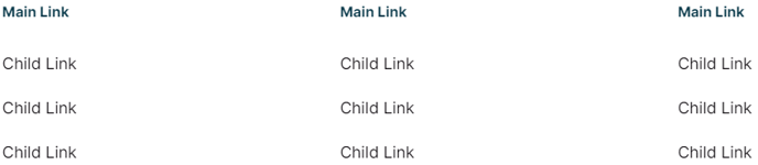
**
Example 2
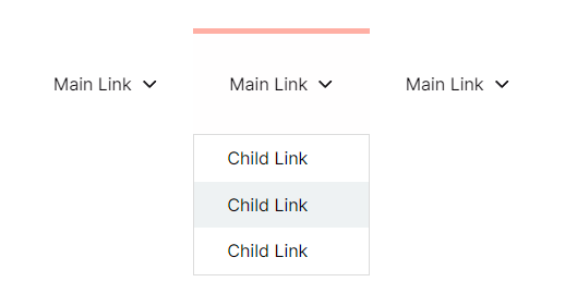 **
**
**Example 3
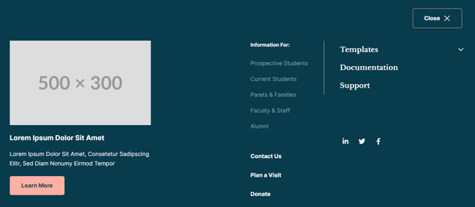 **
**
Content
-
Navigation Type _[Choice]
_Choices: Static, Flyout, Hamburger -
Menu Type _[Choice]
_If Navigation Type is not Hamburger.
Choices: Simple, HubSpot Navigation, Custom -
Simple Menu _[Simple Menu]
_If Menu Type is set to Simple. -
HubSpot Navigation [Menu]
If Menu Type is set to HubSpot Navigation. -
Custom Navigation _[Repeater Group]
_If Menu Type is set to Custom.- Label [Text]
- Link [Link]
- Link Parameters _[Text]
_Add an anchor (#anchor) or URL parameters (?parameter=value) to the link. - Mega Menu _[Boolean]
_If Navigation Type is Flyout. If enabled, each item in the child menu will be a column in the dropdown that let’s you add multiple rows of different types of content. - Max Width _[Number]
_If Mega Menu is selected. Set to 0 to have the mega menu span the full width of the page. - Child Menu [Repeater Group]
- Label _[Text]
_If Mega Menu is not selected. - Link _[Link]
_If Mega Menu is not selected. - Link Parameters _[Text]
_If Mega Menu is not selected. Add an anchor (#anchor) or URL parameters (?parameter=value) to the link. - Column Width _[Number]
_If Mega Menu is selected. Sum of the widths of all columns must not exceed 12. On mobile all columns will span 100% the width of the menu. - Row [Repeater Group]
- Content Type _[Choice]
_Choices: Static Menu, Collapsible Menu, Paged Menu, Descriptive Link, Image, Text, Buttons, Socials, Search - Menu Type _[Choice]
_If Content is set to Static Menu, Collapsible Menu, or Paged Menu.
Choices: Simple, HubSpot Navigation, Custom - Menu _[Simple Menu]
_If Menu Type is set to Simple. - HubSpot Navigation _[Menu]
_If Menu Type is set to HubSpot Navigation] - Custom Navigation _[Repeater Group]
_If Menu Type is set to Custom- Label [Text]
- Link [Link]
- Link Parameters _[Text]
_Add an anchor (#anchor) or URL parameters (?parameter=value) to the link.
- Icon _[Common Module Fields]
_If Content Type is set to Descriptive Link. - Label _[Text]
_If Content Type is set to Descriptive Link. - Link _[Link]
_If Content Type is set to Descriptive Link. - Link Parameters _[Text]
_If Content Type is set to Descriptive Link. Add an anchor (#anchor) or URL parameters (?parameter=value) to the link. - Link Description _[Text]
_If Content Type is set to Descriptive Link. - Image _[Image]
_If Content Type is set to Image. - Text _[Common Module Fields]
_If Content Type is set to Text. - Buttons _[Common Module Fields]
_If Content Type is set to Buttons. - Put buttons on single row? _[Boolean]
_If Content Type is set to Buttons. - Full width buttons? _[Boolean]
_If Content Type is set to Buttons. - Social Media Links _[Repeater Group]
_If Content Type is set to Socials.- Social Media Link [Common Module Fields]
- Search _[Common Module Fields]
_If Content Type is set to Search. - Background [Group]
- Color [Color]
- Borders [Group]
- Style [Choice]Choices: None, Solid, Dotted, Dashed, Double
- Color [Color]
- Width [Number]
- Custom Sides [Boolean]
- Sides _[Multi-Choice]
_Choices: Top, Bottom, Left, Right - Radius [Number]
- Spacing [Group]
- Margin Top [Number]
- Margin Bottom [Number]
- Padding Top [Number]
- Padding Bottom [Number]
- Padding Right [Number]
- Padding Left [Number]
- Content Type _[Choice]
- Label _[Text]
- Background [Group]
- Color [Color]
- Borders [Group]
- Style [Choice]Choices: None, Solid, Dotted, Dashed, Double
- Color [Color]
- Width [Number]
- Custom Sides [Boolean]
- Sides _[Multi-Choice]
_Choices: Top, Bottom, Left, Right - Radius [Number]
- Spacing [Group]
- Padding Top [Number]
- Padding Bottom [Number]
- Padding Right [Number]
- Padding Left [Number]
-
Columns _[Group]
_If Navigation Type is set to Static. Number of columns to split menu into. Set to 0 to distribute all items evenly on one row.- Desktop [Number]
- Tablet [Number]
- Mobile [Number]
-
Position _[Choice]
_If Navigation Type is set to Hamburger. Position of the popover menu within the browser window. Set to Dropdown to have the menu drop down from the toggle instead.
Choices: Left, Center, Right, Dropdown -
Max Width _[Number]
_If Navigation Type is set to Hamburger. Set to 0 to have the mega menu span the full width of the page. -
Menu _[Repeater Group]
_If Navigation Type is set to Hamburger. On mobile all columns will be 100% width.- Column Width _[Number]
_Sum of the widths of all columns must not exceed 12. On mobile all columns will span 100% the width of the menu. - Row [Repeater Group]
- Content Type _[Choice]
_Choices: Static Menu, Collapsible Menu, Paged Menu, Descriptive Link, Image, Text, Buttons, Socials, Search - Menu Type _[Choice]
_If Content is set to Static Menu, Collapsible Menu, or Paged Menu.
Choices: Simple, HubSpot Navigation, Custom - Menu _[Simple Menu]
_If Menu Type is set to Simple. - HubSpot Navigation _[Menu]
_If Menu Type is set to HubSpot Navigation] - Custom Navigation _[Repeater Group]
_If Menu Type is set to Custom- Label [Text]
- Link [Link]
- Link Parameters _[Text]
_Add an anchor (#anchor) or URL parameters (?parameter=value) to the link.
- Icon _[Common Module Fields]
_If Content Type is set to Descriptive Link. - Label _[Text]
_If Content Type is set to Descriptive Link. - Link _[Link]
_If Content Type is set to Descriptive Link. - Link Parameters _[Text]
_If Content Type is set to Descriptive Link. Add an anchor (#anchor) or URL parameters (?parameter=value) to the link. - Link Description _[Text]
_If Content Type is set to Descriptive Link. - Image _[Image]
_If Content Type is set to Image. - Text _[Common Module Fields]
_If Content Type is set to Text. - Buttons _[Common Module Fields]
_If Content Type is set to Buttons. - Put buttons on single row? _[Boolean]
_If Content Type is set to Buttons. - Full width buttons? _[Boolean]
_If Content Type is set to Buttons. - Social Media Links _[Repeater Group]
_If Content Type is set to Socials.- Social Media Link [Common Module Fields]
- Search _[Common Module Fields]
_If Content Type is set to Search. - Background [Group]
- Color [Color]
- Borders [Group]
- Style [Choice]Choices: None, Solid, Dotted, Dashed, Double
- Color [Color]
- Width [Number]
- Custom Sides [Boolean]
- Sides _[Multi-Choice]
_Choices: Top, Bottom, Left, Right - Radius [Number]
- Spacing [Group]
- Margin Top [Number]
- Margin Bottom [Number]
- Padding Top [Number]
- Padding Bottom [Number]
- Padding Right [Number]
- Padding Left [Number]
- Content Type _[Choice]
- Column Width _[Number]
-
- Alignment [Group]
- Desktop _[Choice]
_Choices: Left, Center, Right - Tablet _[Choice]
_Choices: Left, Center, Right - Mobile _[Choice]
_Choices: Left, Center, Right
- Desktop _[Choice]
- Background [Group]
- Color [Color]
- Borders [Group]
- Style [Choice]Choices: None, Solid, Dotted, Dashed, Double
- Color [Color]
- Width [Number]
- Custom Sides [Boolean]
- Sides _[Multi-Choice]
_Choices: Top, Bottom, Left, Right - Radius [Number]
- Spacing [Group]
- Padding Top [Number]
- Padding Bottom [Number]
- Padding Right [Number]
- Padding Left [Number]
- Alignment [Group]
-
Strings _[Group]
_Text strings used throughout the module code for accessibility, placeholders, etc.- Menu ID _[Text] [Required]
_If Navigation Type is not Static; A unique ID used in aria control markup for screen readers. - Menu Label [Text]
Label to display next to a hamburger toggle. - Close Label [Text]
Label to display next to a close button.
- Menu ID _[Text] [Required]
-
- **Nav Aria Label
**A unique label for the nav element so screen readers can differentiate it from other nav elements on the page. - Hamburger Button Screen Reader Text _[Text] [Required]
_Use % to insert the hamburger menu label into the text if one is set. - Close Button Screen Reader Text _[Text] [Required]
_Use % to insert the hamburger menu label into the text if one is set. - Nav Item Toggle Screen Reader Text _[Text] [Required]
_Using %label% will dynamically add the link’s label within the text.
- **Nav Aria Label
-
Advanced [Custom Module Fields]
Style
- Module [Group]
- Module Styles [Common Module Fields]
- Dropdowns/Popovers [Group]
- Dark Mode [Boolean]
- Hamburger Open Button _[Choice]
_Choices: Primary, Secondary, Tertiary, Quaternary, Text Link, Text Link (Dark) - Hamburger Close Button _[Choice]
_Choices: Primary, Secondary, Tertiary, Quaternary, Text Link, Text Link (Dark) - Spacing between columns [Number]
- Spacing between rows [Number]
- Box Styles [Common Module Fields]
- Main Links [Group]
- Text [Group]
- Text Alignment [Group]
- Desktop, Tablet, Mobile [Responsive Alignment]
- Font Styles [Common Module Fields]
- Text Alignment [Group]
- Text [Group]
- Child Links [Group]
- Text [Group]
- Text Alignment [Group]
- Desktop, Tablet, Mobile [Responsive Alignment]
- Font Styles [Common Module Fields]
- Text Alignment [Group]
- Text [Group]
- Descriptive Links [Group]
- Text Alignment [Alignment]
- Link [Group]
- Font Styles [Common Module Fields]
- Descriptions [Group]
- Font Styles [Common Module Fields]
- Collapsible Menu
- Main Links [Group]
- Space between links [Number]
- Text [Group]
- Text Alignment [Group]
- Desktop, Tablet, Mobile [Responsive Alignment]
- Font Styles [Common Module Fields]
- Text Alignment [Group]
- Child Links [Group]
- Space between links [Number]
- Text [Group]
- Text Alignment [Group]
- Desktop, Tablet, Mobile [Responsive Alignment]
- Font Styles [Common Module Fields]
- Text Alignment [Group]
- Text [Group]
- Text Styles [Common Module Fields]
- Search [Group]
- Search Styles [Common Module Fields]
- Socials [Group]
- Icons Styles [Common Module Fields]
- Main Links [Group]