Overview
A box of condensed informational content.
View a live demo of this module.
The following is a detailed listing of all the Content and Style fields available in this module.
Content
- Heading [Text]
- Semantic Heading Level [Number] [Required]
- Style Heading Level [Number] [Required]
- Tags [Repeater Text]
- Info Items [Repeater Group]
- Heading [Text]
- Tooltip [Text]
- Text [Rich Text]
- Buttons [Repeater Group]
- Button [Common Module Fields]
- Layout [Group]
- Divider symbol between tags _[Choice] [Required]
_Choices: None, Slash, Vertical Bar, Bullet, Caret
- Divider symbol between tags _[Choice] [Required]
- Advanced [Common Module Fields]
Styles
- Dark Mode [Boolean]
Check to use the Dark Mode colors set in the Theme Settings. - Module [Group]
- Module Styles [Common Module Fields]
- Heading [Group]
- Font Styles [Common Module Fields]
- Border [Border]
- Tags [Group]
- Font Styles [Common Module Fields]
- Info [Group]
- Heading [Group]
- Font Styles [Common Module Fields]
- Tooltip [Group]
- Font Styles [Common Module Fields]
- Box Styles [Common Module Fields]
- Text [Group]
- Font Styles [Common Module Fields]
- Spacing [Spacing]
- Heading [Group]
- Buttons [Group]
- Spacing [Spacing]
How to Use This Module
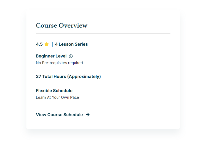
The Overview module serves as a powerful content summary tool that transforms complex information into digestible, scannable blocks. This module excels when you need to present key details, specifications, or highlights without overwhelming your visitors with dense paragraphs of text.
When to use the Overview module: This component works exceptionally well on program pages, course descriptions, event details, and resource libraries where you need to communicate essential information quickly. Education institutions can use it to highlight degree requirements, while event organizers can showcase speaker credentials or session details.
In the HubSpot page editor, you’ll find this module particularly versatile for landing pages and detail pages where conversion depends on clear information presentation. The structured format helps visitors quickly assess whether your content meets their needs, improving both user experience and page engagement metrics.
The Tags field creates visual categorization that helps visitors understand content context at a glance. Use tags for subjects, difficulty levels, or content types. The Info Items repeater allows you to build custom fact sheets or specification lists, while the Tooltip functionality provides additional context without cluttering the main view.
Pro tip: Leverage the Semantic and Style Heading Levels to maintain proper page hierarchy while achieving your desired visual presentation. This ensures your pages remain accessible and SEO-friendly even when design requirements differ from content structure.
The module’s Dark Mode toggle automatically adapts to your theme settings, making it ideal for pages that need to match different visual contexts. When styling, remember that the extensive typography controls allow you to create visual hierarchy within the info items themselves, guiding readers through your content systematically.