Blog Post - Hero
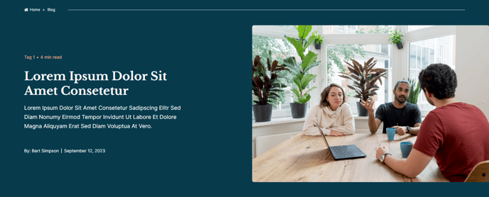
A blog post hero with breadcrumbs, post information, and featured image.
View a live demo of this partial here.
The following is a detailed listing of the styling edits made to the partial’s sections, the modules used in the sections, and field changes from the modules’ default state.
Section 1
Section Styles
Alignment and spacing > Max width
theme.global.max_width_wide
Alignment and spacing > Padding
top: 1, bottom: 1
Alignment and spacing > Vertical alignment
MIDDLE
Background > Background color
theme.global.colors.backgrounds.medium_dark.color
Modules
**
Section Settings**
Section Options
Custom Columns
Custom Columns
{number: 1, width: {desktop: {fit_content: true}, {mobile: {unit: %, width: 100}},
{number: 2, margin: {desktop: {left: 25}, mobile: {top: 0, left: 0}}
Utility Items
Type: Link List
Layout > Divider
Caret
Layout > Spacing
8
Styles > Dark Mode
true
Styles > Links > Font
size: theme.typography.body_text_tiny.font.size
color: theme.typography.body_text.dark_mode.color
Section 2
Section Styles
Alignment and spacing > Max width
theme.global.max_width_wide
Alignment and spacing > Vertical alignment
MIDDLE
Alignment and spacing > Padding
top: 40, bottom: 50
Background > Background color
theme.global.colors.backgrounds.medium_dark.color
Modules
Section Options
Custom Columns
Custom Columns
{number: 1, width: {desktop: {unit: px, width: 575}, mobile: {unit: %, width: 100}},
{number: 2, margin: {desktop: {left: 190}, tablet: {left: 50}, mobile: {left: 0}}
Style
Simple
Custom Tags
{dynamic_data: true, data_type: blog-tags, is_blog_post: true},
{dyanmic_data: true, data_type: read-time}
Layout > Divider
Bullet
Layout > Spacing
5
Styles > Dark Mode
true
Heading
content.name
Semantic Heading Level
1
Text
content.meta_description
Styles > Dark Mode
true
Styles > Module > Spacing > Desktop > Padding
top: theme.global.spacing.rows,
bottom: theme.global.spacings.rows * 2
Style
Simple
Custom Tags
{dynamic_data: true, data_type: author-name,
{dynamic_data: true, data_type: publish-date}
Layout > Divider
Vertical Bar
Layout > Spacing
6
Styles > Dark Mode
true
Styles > Tags > Font > Color
theme.typography.body_text.dark_mode.color
Type
Image
Content Type
Featured Image
Displace from Row > Image is in:
Far Right Column
Displace from Row > Section Width
theme.global.max_width_wide
Styles > Image > Borders > Radius
theme.global.borders.radius