System - 500 Error
Partial for use on System - 500 Error template.
The following is a detailed listing of the styling edits made to the partial’s sections, the modules used in the sections, and field changes from the modules’ default state.
Section 1
Section Styles
Alignment and spacing > Padding
Top: theme.global.spacing.sections / 2
Background > Background color
theme.global.colors.backgrounds.medium_dark.color
Modules
Visible Elements
Heading
Semantic Heading Level
1
Style Heading Level
4
Styles > Dark Mode
true
Styles > Text Alignment
Desktop: Center
Styles > Heading > Font
Size: 278
Color: theme.global.colors.backgrounds.dark.color
Styles > Heading > Line Height
1
Styles > Heading > Mobile Font Size
175
Media Type
Image
Image
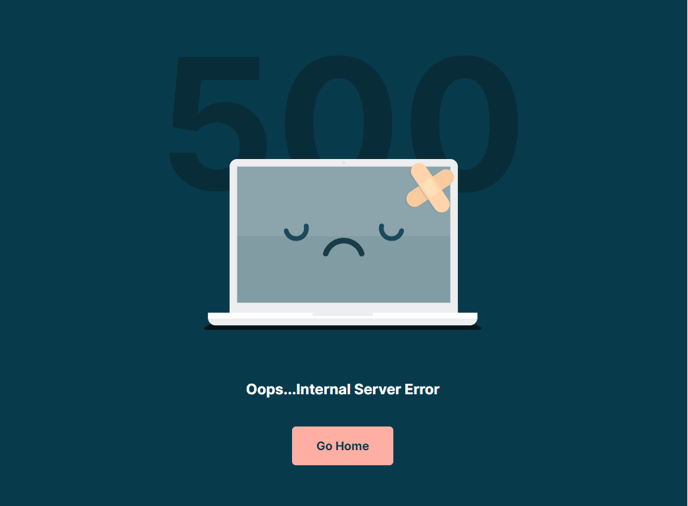
Src: 500-pc-broke.svg
Styles > Module > Spacing > Desktop > Margin
Top: -85
Bottom: 75
Styles > Module > Spacing > Mobile > Margin
Top: -25
Styles > Text Alignment
Desktop: Center
Visible Elements
Heading
Style Heading Level
4
Styles > Dark Mode
true
Styles > Text Alignment
Desktop: Center
Utility Items
Utility Type: Button
Styles > Module > Alignment
Desktop: Center
Styles > Module > Spacing > Desktop > Margin
Top: 40
Understanding the 500 Error Partial
This global partial serves as your site’s default 500 error page, which displays when visitors encounter internal server errors. Unlike other theme partials that you’ll customize extensively, this component is designed as a safety net that should remain largely unchanged once configured.
The partial uses the Rubric theme’s signature content-first approach with a clean, centered layout that maintains your brand consistency even during technical difficulties. The dark background creates a calming effect while the custom SVG illustration (500-pc-broke.svg) adds visual context without being alarming to visitors.
When customizing this partial, focus on the text content rather than the visual structure. You can update the heading text to match your institution’s voice—for example, “Temporary Technical Difficulty” for educational sites or “We’re Working on It” for event platforms. The utility button should direct users to your homepage or a status page where they can find updates.
Key considerations for implementation: Since this is a global partial, any edits you make will automatically apply across your entire site. Test your changes in the page editor’s preview mode, but remember that you won’t see this page during normal site browsing. The responsive margin adjustments ensure the layout works properly on mobile devices, where error pages are often viewed during connectivity issues.
For educational institutions, consider customizing the button text to direct users to student portals or course catalogs. Event-focused sites might link to registration pages or event schedules. The centered alignment and readable typography ensure accessibility standards are maintained, which is particularly important for institutional websites that must comply with educational accessibility requirements.