System - Membership Login
Partial for use on System - Membership Login template.
The following is a detailed listing of the styling edits made to the partial’s sections, the modules used in the sections, and field changes from the modules’ default state.
Section 1
Section Styles
Alignment and spacing > Content alignment
Full Width
Alignment and spacing > Padding > Default
Top: 50
Right: 90
Bottom: 50
Left: 90
Alignment and spacing > Padding > Mobile
Top: 50
Right: 50
Bottom: 50
Left: 50
Background > Background color
theme.global.colors.backgrounds.base.color
Modules
Styles > Max Width
600
Styles > Borders > Radius
theme.global.borders.radius
Visible Elements
Heading
Semantic Heading Level
1
Style Heading Level
3
Styles > Module > Spacing > Desktop > Margin
Bottom: 35
Styles > Text Alignment
Desktop: Center
Page Type
Membership Login
Form Layout > Button Position
Full
Visible Elements
Body Text
Text Size
Small
Styles > Module > Max Width
350
Styles > Module > Alignment
Desktop: Center
Styles > Module > Spacing > Desktop > Margin
Top: 35
Styles > Text Alignment
Desktop: Center
Usage Guide
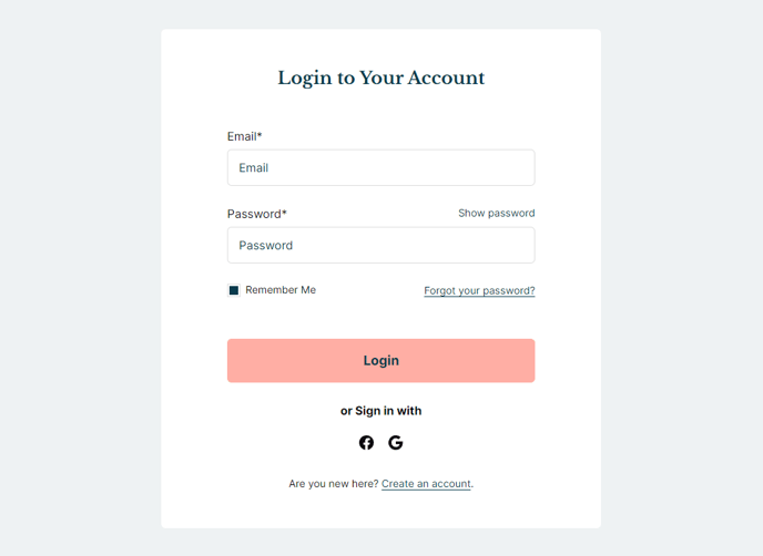
The System - Membership Login partial provides a clean, centered interface for HubSpot’s membership authentication functionality. This partial is automatically applied to your membership login system pages and cannot be manually added to other page types through the drag-and-drop editor.
When visitors access gated content or membership-protected areas of your site, they’ll be directed to this login interface. The partial creates a focused, distraction-free experience with a maximum width of 600 pixels and rounded corners that match your theme’s global border radius settings. This contained layout prevents the login form from stretching across wide screens, maintaining readability and professional appearance.
Key customization opportunities include modifying the heading text through the Text Block module to match your institution’s branding voice. You can update messaging like “Student Portal Access” or “Member Login” to provide clearer context for your users. The bottom Text Block is ideal for adding helpful links such as “Forgot your password?” or contact information for technical support.
The full-width button positioning ensures the login button spans the entire form width, creating better visual hierarchy and improved mobile usability. On smaller screens, the responsive padding automatically adjusts from 90 pixels to 50 pixels on each side, maintaining proper spacing without cramping the interface.
Best practice tip: If you’re using this partial for educational institutions, consider adding institutional branding elements or specific instructions in the text blocks. For event-based sites, you might include event-specific messaging or deadlines. Remember that changes made to this partial will automatically update across all membership login pages on your site, so test thoroughly in the page editor preview before publishing.
The background automatically inherits your theme’s base color settings, ensuring consistency with your overall site design without requiring manual color adjustments.