Detailed Information
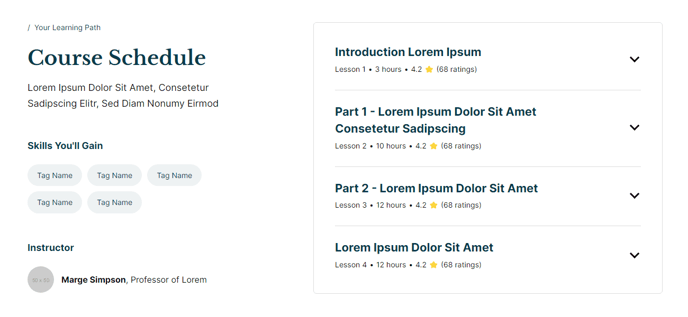
A two-column section to provide detailed information using text, tag list, single line icon, and collapsible content.
View a live demo of this section here.
The following is a detailed listing of the styling edits made to the section, the modules used in the section, and field changes from the modules’ default state.
Section Styles
No styles have been applied.
Modules
**
Text Block**
No changes to default content.
**
Text Block**
Semantic Heading Level
3
Style Heading Level
5
Styles > Spacing > Desktop > Padding
Top: theme.global.spacing.sections / 2,
Bottom: 20
**Tags
**No changes to default content.
Semantic Heading Level
3
Style Heading Level
5
Styles > Spacing > Desktop > Padding
Top: theme.global.spacing.sections / 2,
Bottom: 20
Layout > Icon Position
Left
Layout > Icon Spacing
14
Layout > Desktop
Columns: 1
Justify: Start
Layout > Tablet
Columns: 1
Justify: Start
Layout > Mobile
Columns: 1
Gap: 100
Justify: Start
Styles > Alignment > Desktop
Left
Styles > Icon > Borders
Radius: 100
Styles > Module > Max Width
660
Styles > Module > Alignment
Desktop: Right
Styles > Module > Borders
Border Style: theme.global.borders.border_style
Radius: theme.global.borders.radius
Styles > Module > Spacing > Desktop
Top: 15
Right: 40
Bottom: 15
Left: 40
Styles > Summary > Borders
Remove Bottom Border: true
Usage Guide
The Detailed Information section provides an asymmetrical two-column layout that’s particularly effective for showcasing complex information in an organized, scannable format. You’ll find this section most useful on program pages, course descriptions, event details, or resource hubs where you need to present both overview content and specific details side-by-side.
When adding this section through the page editor’s drag-and-drop interface, you’ll notice the left column is designed for broader contextual information using text blocks and tag lists, while the right column focuses on specific details through icon-highlighted features and expandable content. This visual hierarchy helps visitors quickly scan for relevant information without feeling overwhelmed.
Choose this section when you need to present information that benefits from both immediate visibility and progressive disclosure. The collapsible content module on the right is particularly valuable for FAQ-style information, detailed specifications, or supplementary details that might clutter the main content area. Education institutions often use this layout for degree program pages, where the left side covers program overview and benefits, while the right side houses admission requirements, course lists, or career outcomes in collapsible sections.
The icon text module works exceptionally well for highlighting key features, contact information, or important dates. Since the icons include rounded borders by default, they maintain visual consistency with Rubric’s content-first design philosophy while drawing attention to critical details.
Pro tip: When customizing the tag list, consider using it for categorization elements like “Prerequisites,” “Duration,” or “Difficulty Level” rather than generic keywords. This helps visitors quickly assess whether the content matches their needs before diving into the detailed information.