Featured Event Slider
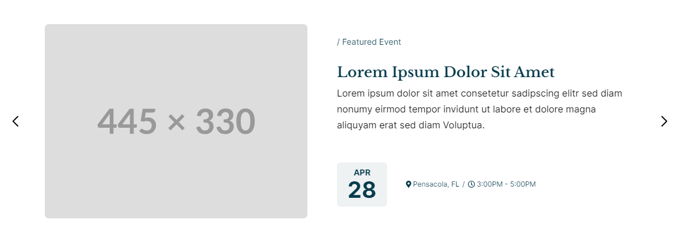
Stylized slider of featured events.
View a live demo of this section here.
The following is a detailed listing of the styling edits made to the section, the modules used in the section, and field changes from the modules’ default state.
Section Styles
Padding
Top: 0
Modules
Section Options
Overlap
Overlap > Section
Above
Card Style
Slider
Layout > Text Tags Position
Bottom
Layout > Date Position
Left of Tags
Layout > Desktop
Thumbnail Position: Left
Image Spacing: theme.global.spacing.columns.desktop
Spacing: 0
Per Page: 1
Per Move: 1
Show Pagination: false
Layout > Tablet
Thumbnail Position: LeftImage Spacing: theme.global.spacing.columns.desktopSpacing: 0Per Page: 1Per Move: 1
Show Arrows: falseShow Pagination: true
Layout > Mobile
Thumbnail Position: TopImage Spacing: theme.global.spacing.columns.mobile**
Spacing: 0
Per Page: 1
Per Move: 1
Show Arrows: false
Show Pagination: true**
Styles > Mobile > Background
Background Color: theme.global.colors.backgrounds.base.color
Styles > Module > Borders
Radius: theme.global.borders.radius
Styles > Module > Spacing > Desktop > Padding
Top: theme.global.spacing.columns.desktop
Right: theme.global.spacing.columns.desktop * 2
Bottom: theme.global.spacing.columns.desktop
Left: theme.global.spacing.columns.desktop * 2
Styles > Module > Spacing > Tablet > Padding
Top: theme.global.spacing.columns.desktopRight: theme.global.spacing.columns.desktop**
Bottom:** theme.global.spacing.columns.desktopLeft: theme.global.spacing.columns.desktop
Styles > Thumbnail > Width
445
Styles > Thumbnail > Aspect Ratio
Unset
Styles > Thumbnail > Borders
Radius: theme.global.borders.radius
Styles > Title > Font
theme.typography.heading_three.font
Styles > Title > Mobile Font Size
theme.typography.heading_three.mobile_font_size
Styles > Text Tags > Margin
Top: theme.global.spacing.rows * 2
Styles > Card > Borders
Border Style: {Top: {Style: None}}
Styles > Card > Box Shadow
Animate: None
Usage Guide
The Featured Event Slider section is designed to prominently showcase your most important upcoming events in an engaging, carousel-style layout. This section works exceptionally well on your homepage, event landing pages, or dedicated event portal pages where you want to draw immediate attention to featured programming.
When you add this section through HubSpot’s drag-and-drop page editor, you’ll notice it creates an overlapping visual effect with the section above it, giving your events more visual prominence on the page. This makes it particularly effective when placed after a hero section or banner.
The slider automatically adapts its behavior across devices to optimize user experience. On desktop, visitors can navigate through events using arrow controls while viewing one featured event at a time. The layout shifts on tablet and mobile devices to include pagination dots instead of arrows, making touch navigation more intuitive for mobile users.
Content Strategy Tips: This section works best when you limit featured events to your 3-5 most important upcoming programs. Since only one event displays at a time, avoid overwhelming visitors with too many options. Consider featuring events that represent different categories or appeal to various audience segments within your institution.
Setup Recommendations: Before adding this section, ensure your events are properly tagged in HubSpot’s content management system. The Listed Resources module that powers this section can filter events by tags, allowing you to automatically display only events marked as “featured” or “priority.” This approach lets you maintain the slider content by simply updating your event tags rather than manually editing the section each time your featured events change.
The responsive design ensures your event details remain readable and visually appealing whether visitors access your site from a desktop computer or mobile device.