Featured Items - Calls to Action
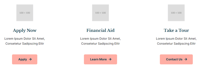
A row of three icons, text, and button.
View a live demo of this section here.
The following is a detailed listing of the styling edits made to the section, the modules used in the section, and field changes from the modules’ default state (not including visible placeholder text and images).
Section Styles
Alignment and spacing > Padding
Top: theme.global.spacing.sections
Modules
No changes to default content.
Usage Guide
The Featured Items - Calls to Action section creates a clean, horizontal layout perfect for highlighting your institution’s key programs, services, or initiatives. This three-column design works exceptionally well on homepage hero areas, program overview pages, and landing pages where you need to guide visitors toward specific actions.
Each column in this section uses the Icon Text module, allowing you to combine visual icons with descriptive text and actionable buttons. This makes it ideal for education institutions showcasing degree programs, campus services, or admissions pathways. Event organizers can use it to highlight registration options, speaker spotlights, or session categories.
When adding this section through the page editor’s drag-and-drop interface, you’ll find it automatically applies the theme’s global section spacing for consistent vertical rhythm across your site. The responsive design ensures your three featured items stack appropriately on mobile devices while maintaining visual hierarchy.
Customization tips for content editors:
- Choose icons that clearly represent each featured item’s purpose - academic icons for programs, service icons for campus resources
- Keep your headlines consistent in length across all three columns for balanced visual appeal
- Use action-oriented button text like “Learn More,” “Apply Now,” or “Register Today” rather than generic “Click Here”
- Consider this section’s placement carefully - it works best when visitors need clear direction rather than extensive detail
The section integrates seamlessly with HubSpot’s theme settings, inheriting your brand colors and typography automatically. For resource-heavy sites, this section serves as an effective navigation aid, helping visitors quickly identify and access your most important content areas without overwhelming them with choices.