Featured Items - Callout
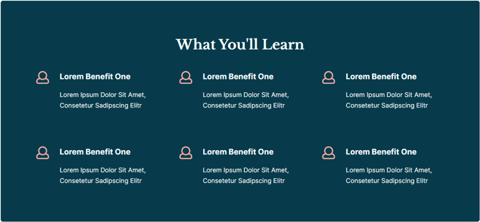
A box of three-column featured items.
View a live demo of this section here.
The following is a detailed listing of the styling edits made to the section, the modules used in the section, and field changes from the modules’ default state.
Section Styles
Alignment and spacing > Max Width
theme.global.max_width_wide
Column Styles
**
Column 1**
Background Color
theme.global.colors.backgrounds.medium_dark.color
Padding > Default
Top: theme.global.spacing.sections
Right: theme.global.spacing.sections
Bottom: theme.global.spacing.sections
Left: theme.global.spacing.sections
Padding > Mobile
Top: theme.global.spacing.sections / 2Right: theme.global.spacing.sections / 2Bottom: theme.global.spacing.sections / 2Left: theme.global.spacing.sections / 2
Modules
Styles > Dark Mode
true
Styles > Module > Spacing > Desktop > Padding
Bottom: theme.global.spacing.rows * 2
Styles > Alignment > Desktop
Center
Layout > Icon Position
Left
Layout > Icon Alignment
Flex Start
Layout > Icon Spacing
30
Layout > Desktop
Row Spacing: theme.global.spacing.sections
Column Spacing: 60
Layout > Mobile
Row Spacing: theme.global.spacing.sections / 2
Styles > Dark Mode
true
Styles > Alignment > Desktop
Left
How to Use This Section
The Featured Items - Callout section creates a compelling visual break on your pages by presenting three key pieces of information against a contrasting dark background. This section works particularly well for highlighting program benefits, key statistics, or important announcements on your education or event pages.
When you add this section through the HubSpot page editor’s drag-and-drop interface, you’ll find it combines a Text Block module for your main heading with an Icon Text module that displays three side-by-side items. The dark background automatically adjusts based on your theme’s color settings, ensuring consistency across your site without manual color picking.
Best practices for content creation: Keep your three featured items concise and parallel in structure. For education sites, consider highlighting enrollment numbers, program outcomes, or campus features. Event organizers can showcase speaker count, networking opportunities, or learning sessions. The left-aligned icons help draw attention while maintaining readability.
The section’s responsive design automatically adjusts spacing on mobile devices, reducing padding by half to optimize the viewing experience on smaller screens. You can customize the icons through the Icon Text module settings, choosing from HubSpot’s icon library or uploading custom graphics that match your brand.
Layout considerations: This section works best when placed between content-heavy areas to provide visual relief. It’s particularly effective after hero sections or before detailed program information. The wide max-width setting ensures your content spans the full page width, creating maximum visual impact while maintaining the theme’s structured design principles.
Remember to preview your changes across different devices using HubSpot’s responsive preview feature to ensure your featured items display properly on all screen sizes.