Form Callout - Informational
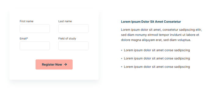
A form call to action with informational text and form that overlaps section above it.
View a live demo of this section here.
The following is a detailed listing of the styling edits made to the section, the modules used in the section, and field changes from the modules’ default state.
Section Styles
Alignment and spacing > Vertical Alignment
Middle
Alignment and spacing > Padding
Top: 0
Modules
Section Options
Overlap
Overlap > Section
Above
Overlap > Distance
12
Media Type
Form
Styles > Module > Max Width
520
Styles > Module > Background
Color: theme.global.colors.backgrounds.base
Styles > Module > Borders
Radius: theme.global.borders.radius
Styles > Module > Box Shadow
Color: theme.global.box_shadows.color
Offset X: theme.global.box_shadows.offset_x
Offset Y: theme.global.box_shadows.offset_y
Blur: theme.global.box_shadows.blur
Spread: theme.global.box_shadows.spread
Styles > Module > Spacing > Desktop > Padding
Top: 60
Right: 60
Bottom: 60
Left: 60
Style Heading Level
5
Styles > Module > Max Width
500
Styles > Module > Alignment
Desktop: Center
Tablet: Left
How to Use This Section
The Form Callout - Informational section creates a sophisticated visual overlap effect that draws attention to your lead capture forms while maintaining a professional appearance. This section is particularly effective for educational institutions and event organizers who need to balance information delivery with conversion optimization.
When you add this section to your page through the HubSpot page editor, it automatically positions itself to overlap the section directly above it by 12 pixels, creating a seamless layered design. This overlap technique works especially well when preceded by hero sections, image galleries, or content blocks that have sufficient bottom spacing.
The section’s strength lies in its dual-purpose layout — the Text Block module on one side delivers key messaging or event details, while the Media module configured as a form captures visitor information. The form container includes built-in styling with background colors, border radius, and box shadows that inherit from your theme’s global settings, ensuring consistent branding across your site.
Best practices for implementation: Use this section on landing pages, course registration pages, or event announcement pages where you want to present important information alongside a contact form. The center alignment on desktop ensures the content remains readable on larger screens, while the left alignment on tablet devices optimizes the layout for mobile users.
To maximize effectiveness, keep your Text Block content concise and action-oriented. The Style Heading Level 5 creates appropriate hierarchy without overwhelming the form element. When configuring the form in the Media module, choose HubSpot forms with 3-4 fields maximum to maintain the clean, uncluttered aesthetic this section is designed to achieve.