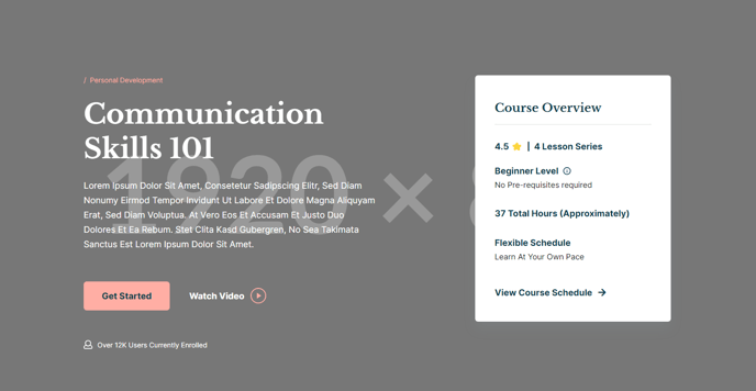
Hero - Detailed
A twocolumn hero with text, call to action, popup video, and overview to provide a detailed summary of a resource.
View a live demo of this section here.
The following is a detailed listing of the styling edits made to the section, the modules used in the section, and field changes from the modules’ default state.
Section Styles
Alignment and spacing > Padding
Top: 160
Bottom: 85
Modules
Semantic Heading Level
1
Style Heading Level
1
Styles > Dark Mode
true
Utility Items > Utility Type
Button
Styles > Module > Spacing > Desktop > Padding
Top: 60
Bottom: 60
Layout > Icon Position
Left
Layout > Desktop
Columns: 1
Justify: Start
Layout > Tablet
Columns: 1
Justify: Start
Layout > Mobile
Columns: 1
Justify: Start
Styles > Dark Mode
true
Styles > Alignment
Desktop: Left
Styles > Module > Max Width
400
Styles > Module > Alignment
Desktop: Right
Tablet: Center
How to Use This Section
The Hero - Detailed section provides a comprehensive introduction layout that’s perfect for course pages, resource libraries, and detailed program descriptions on your HubSpot site. This two-column design balances engaging visual content with structured information, making it ideal when you need to communicate multiple key points while maintaining visual appeal.
When to choose this section: Use the Hero - Detailed when you’re promoting educational content, courses, or resources that require more explanation than a simple hero can provide. The built-in overview module makes it particularly effective for landing pages where visitors need quick access to key details like course duration, difficulty level, or resource specifications.
Content strategy tips: The left column works best with compelling headlines and clear value propositions, while the popup video functionality allows you to include testimonials or preview content without cluttering the layout. The icon-text module is perfect for highlighting key benefits or course features using visual icons that reinforce your messaging.
Customization in the page editor: You can easily adjust the dark mode styling through the module settings if your brand requires different contrast levels. The overview module’s right alignment creates natural visual balance, but you can modify the max-width setting to accommodate longer content lists or additional details.
Page type recommendations: This section excels on course detail pages, event landing pages, and resource download pages where you need to provide comprehensive information upfront. The structured layout helps reduce bounce rates by giving visitors immediate access to the information they’re seeking while encouraging engagement through the call-to-action elements.