Hero - Sign Up
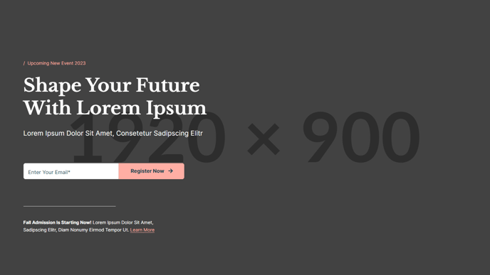
Large, one column hero with heading, form, and informational text.
**
View a live demo of this section here.**
The following is a detailed listing of the styling edits made to the section, the modules used in the section, and field changes from the modules’ default state.
Section Styles
Alignment and spacing > Padding
Top: 190
Bottom: 130
Modules
Toggle Options
Add Overlay
Visible Elements
Eyebrow, Heading, Subheading
Semantic Heading Level
1
Style Heading Level
1
Styles > Dark Mode
true
Media Type
Form
Form Layout > Inset Labels
true
Form Layout > Button Position
Left
Styles > Dark Mode
true
Styles > Module > Max Width
500
Styles > Module > Spacing > Desktop > Padding
Top: 60
Horizontal Size
50
Styles > Module > Alignment
Desktop: Left
Styles > Module > Spacing > Desktop > Padding
Top: 70
Bottom: 30
Visible Elements
Body Text
Text Size
Small
Styles > Dark Mode
true
Styles > Module > Max Width
450
When to Use This Section
The Hero - Sign Up section creates a compelling lead capture experience perfect for enrollment campaigns, event registrations, or newsletter subscriptions. This single-column layout prioritizes form completion by presenting a clean, distraction-free design that works exceptionally well on landing pages and homepage headers.
The section’s dark mode styling automatically applies sophisticated contrast that makes your call-to-action stand out, while the structured content hierarchy guides visitors naturally from headline to form submission. The generous padding (190px top, 130px bottom) ensures your hero content commands attention on desktop screens while maintaining visual breathing room.
Setting Up Your Sign-Up Hero
When adding this section through the HubSpot page editor’s drag-and-drop interface, connect your HubSpot form through the Media module’s form selector. The preset 500px max-width and inset label styling create an approachable form experience that doesn’t overwhelm users with excessive width or cluttered field layouts.
Use the Text Block modules strategically: the top block for your primary value proposition with eyebrow text for context, and the bottom block for trust signals, privacy assurances, or additional details that support conversion. The divider line provides visual separation while maintaining the section’s cohesive flow.
Optimization Tips
This section works best when your headline directly addresses the benefit of signing up, while the supporting text below the form addresses common objections or highlights what users receive. Consider A/B testing different headline approaches through HubSpot’s optimization tools, and ensure your form fields align with your lead nurturing strategy. The left-aligned button positioning follows natural reading patterns and typically performs well for conversion-focused layouts.