Related Resources - Two Tone
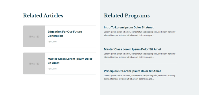
A two-column section with a two-tone background and two lists of manually added resources. The left side list is Card style, and the right side list is List style.
Section Styles
No styles have been applied
Modules
Toggle Options
Add Two Tone Background
Styles > Module > Spacing > Desktop > Padding
Bottom: 35
Card Style
Grid
Layout > Desktop
Thumbnail Position: Left
Columns: 1
Layout > Tablet
Columns: 1
Layout > Mobile
Thumbnail Position: LeftColumns: 1
Styles > Title > Font
theme.typography.heading_four.font
Styles > Thumbnail > Aspect Ratio
1:1
Visible Elements
Heading
Styles > Module > Spacing > Desktop > padding
Bottom: 35
Card Style
List
Styles > Card > Box Shadow
Animate: None
How to Use This Section
The Related Resources - Two Tone section is designed to showcase complementary content in an engaging, asymmetrical layout that breaks up standard page designs. This section works particularly well on resource pages, course detail pages, and event landing pages where you want to highlight both featured content and quick reference materials.
The two-tone background option creates visual separation between your main content and related resources, making this section ideal for bottom-of-page placement or as a content break in longer pages. When you enable this toggle in the Section Settings, you’ll get a contrasting background that helps draw attention to your curated resources.
Content strategy tip: Use the left column’s card-style layout for your most important related resources—the larger thumbnails and prominent titles make these items more clickable. The right column’s list style works perfectly for quick reference links, additional reading, or supplementary materials that support your main content.
When adding this section through HubSpot’s page editor, you’ll find it most effective on pages where visitors are likely seeking additional information. For education sites, pair course descriptions with related courses (left) and quick links to syllabi or schedules (right). Event pages can feature upcoming events alongside resource downloads.
Responsive considerations: The section maintains its two-column desktop layout on tablets but stacks vertically on mobile devices. Both Listed Resources modules are configured with left-aligned thumbnails and single-column layouts across all breakpoints, ensuring your content remains scannable on smaller screens.
To maximize engagement, keep your resource lists focused—aim for 3-5 items per column to avoid overwhelming visitors while providing genuine value that encourages further exploration of your site.