Resource Slider
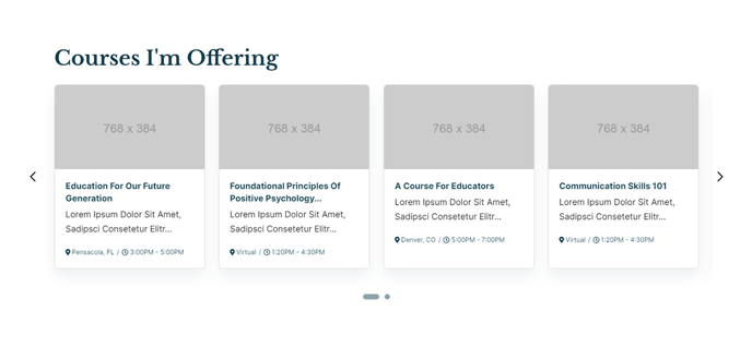
A slider of manually-entered resources, displaying four resources at a time.
View a live demo of this section here.
The following is a detailed listing of the styling edits made to the section, the modules used in the section, and field changes from the modules’ default state.
Section Styles
No styles have been applied.
Modules
Visible Elements
Heading
Styles > Module > Spacing > Desktop > padding
Bottom: theme.global.spacing.rows
Card Style
Slider
Layout > Carousel Type
Slide
Layout > Carousel Rewind
true
Layout > Text Tags Position
Bottom
Layout > Desktop
Per Page: 4
Per Move: 4
Spacing: 25
Layout > Tablet
Per Page: 3
Per Move: 3
Spacing: 20
Layout > Mobile
Per Page: 1
Per Move: 1
Spacing: 0
Styles > Card > Box Shadow
Animate: Animate Out
Styles > Text Tags > Font
Size: theme.typography.body_text_tiny.font.size
Usage Guide
The Resource Slider section is perfect for showcasing featured downloads, course materials, or key documents in an engaging carousel format. Unlike static resource grids, this section draws attention by automatically cycling through your content while allowing visitors to manually navigate between resources.
You can add this section to any page through HubSpot’s drag-and-drop page editor by selecting it from the sections panel. The section works particularly well on homepages where you want to highlight your most popular resources, program pages to showcase related materials, or resource hub landing pages as a featured content area.
The slider’s responsive design automatically adjusts the number of visible resources: four on desktop, three on tablet, and one on mobile. This ensures your content remains readable and accessible across all devices without requiring additional configuration.
When setting up your resources, focus on creating compelling titles and descriptions since the bottom-positioned text tags serve as the primary call-to-action area. The subtle box shadow animation that activates on hover helps draw user attention to interactive elements.
Pro tip: Keep your resource titles consistent in length to maintain visual balance across the four-card desktop layout. If you have more than eight resources, consider whether a filterable resource grid might better serve your users’ browsing needs.
The Text Block module above the slider is ideal for adding context about your resource collection. Use it to explain what visitors will find, highlight new additions, or provide filtering instructions if you’re featuring resources from a specific category or topic area.
This section pairs well with the theme’s structured content approach, making it easy for educational institutions to organize course materials or for event organizers to highlight key documentation.