Text Details
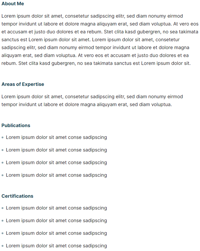
A narrow-width section of four text blocks with headings, paragraphs, and lists to provide detailed information on people, resources, etc.
View a live demo of this section here.
The following is a detailed listing of the styling edits made to the section, the modules used in the section, and field changes from the modules’ default state.
Section Styles
Alignment and spacing > Max width
750
Modules
Visible Elements
Heading, Body Text
Semantic Heading Level
3
Style Heading Level
5
Styles > Module > Spacing > Desktop > Padding
Bottom: theme.global.spacing.rows * 2
Visible Elements
Heading, Body Text
Semantic Heading Level
3
Style Heading Level
5
Styles > Module > Spacing > Desktop > Padding
Bottom: theme.global.spacing.rows * 2
Visible Elements
Heading, Body Text
Semantic Heading Level
3
Style Heading Level
5
Styles > Module > Spacing > Desktop > Padding
Bottom: theme.global.spacing.rows * 2
Visible Elements
Heading, Body Text
Semantic Heading Level
3
Style Heading Level
5
Usage Guide
The Text Details section provides a streamlined, narrow-column layout perfect for presenting in-depth information without overwhelming your site visitors. This section works exceptionally well when you need to break down complex topics into digestible chunks while maintaining visual hierarchy and readability.
You’ll find this section particularly valuable on faculty profile pages, where you can detail education, experience, research interests, and publications in separate text blocks. Event websites can use it to outline speaker bios, session details, or program information, while resource-heavy sites benefit from its ability to present step-by-step processes or detailed explanations.
When adding this section through HubSpot’s page editor, you can drag and drop it anywhere on your page layout. The 750-pixel max width ensures your content remains scannable even on wide desktop screens, creating comfortable reading conditions that encourage engagement.
Each text block within the section maintains consistent semantic heading structure (H3) while displaying as smaller H5-styled headings, giving you proper SEO benefits without disrupting your page’s visual flow. The built-in spacing between blocks creates natural reading breaks, preventing the dense text walls that often discourage visitors from consuming detailed content.
Best practices for this section include keeping your headings parallel in structure and length, using bullet points or numbered lists within the body text to further break up information, and ensuring each text block covers a distinct topic or aspect. Since the Rubric theme emphasizes content-first design, this section integrates seamlessly with other theme elements while giving your detailed information the prominence it deserves.
For educational institutions especially, this section serves as an excellent alternative to traditional sidebar layouts, presenting detailed information in a more focused, distraction-free format.