Event Detail
Provide users with all the information they need about virtual or live events with modules that cover stats, schedules, speakers, and more.
Hidden Modules
Section 1
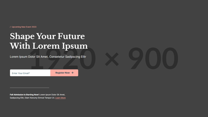
A hero section that showcases the event’s date, name,
registration form, and any other crucial details.
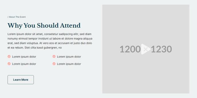
Section 2
Give a brief summary of the event and enhance it with
a captivating image or video.
Section 3
Highlight unique features and accomplishments of the event.
Section Styles
Alignment and spacing > Max width
theme.header.max_width
Alignment and spacing > Padding
top: 0
Background > Background color
theme.global.colors.backgrounds.light.color
Modules
**
Decoration**
Styles > Module > Max Width
theme.global.max_width
Styles > Module > Spacing > Desktop > Padding
top: theme.global.spacing.sections / 1.5,
bottom: theme.global.spacing.sections / 2
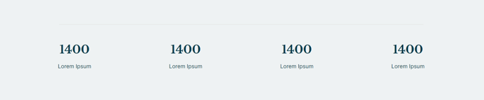
Counter
Is in default state
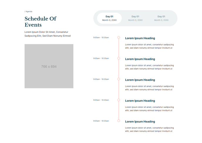
Section 4
Detail out the schedule of the event.
Section Styles
No styles have been applied
Modules
Text
Semantic Heading Level
2
Style Heading Level
2
Media
Image
src: 766x694 placeholder
Styles > Module > Spacing > Desktop > Margin
top: theme.global.spacing.rows * 2
Styles > Module > Animation
Fade Up
Tabs
Styles > Module > Max Width
660
Styles > Module > Alignment
desktop: RIGHT, tablet: LEFT
Section 5
List out who will be speaking at the event.
Section Styles
Background > Background color
theme.global.colors.backgrounds.light.color
Module
Text
Styles > Module > Alignment
desktop: CENTER
Styles > Module > Spacing > Desktop > Padding
bottom: theme.global.spacing.rows * 2
Styles > Text Alignment
desktop: CENTER
**People
**Is in default state
Section 6
Showcase other users’ experiences of the event.
Section Styles
Background > Background color
theme.global.colors.backgrounds.medium_dark.color
**Modules
**
Text
Styles > Dark Mode
true
Styles > Module > Max Width
600
Styles > Module > Spacing > Desktop > Padding
bottom: 50
**
Quotes**
Styles > Dark Mode
true
Styles > Slides > Dark Mode
true
Section 7
List out sponsors of the event.
Section Styles
No styles have been applied
Modules
Text
Styles > Module > Max Width
700
Styles > Module > Alignment
desktop: CENTER
Styles > Text Alignment
desktop: CENTER
Logos
Type
Logo Grid
Styles > Module > Alignment
desktop: CENTER
Styles > Module > Spacing > Desktop > Padding
top: 50
Section 8
Showcase other upcoming events the user
may be interested in attending.
Section Styles
Background > Background color
theme.global.colors.backgrounds.light.color
Modules
Text
Styles > Module > Max Width
700
Styles > Module > Alignment
desktop: CENTER
Styles > Text Alignment
CENTER
Resources
Styles > Module > Spacing > Desktop > Padding
top: theme.global.spacing.rows * 2,
bottom: theme.global.spacing.rows * 2
Utility
Utility Items
{type: button}
Styles > Module > Alignment
desktop: CENTER
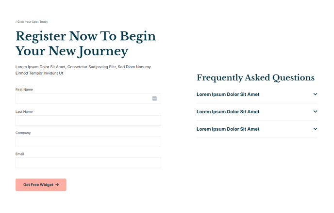
Section 9
Include a more detailed registration form and answers to
frequently asked questions about the event.
**Section Styles
**
Alignment and spacing > Max width
theme.global.max_width_wide
Alignment and spacing > Vertical alignment
MIDDLE
Modules
Text
Style Heading Level
1
Media
Type
form
Form Layout > Button Position
Left
Styles > Module > Spacing > Desktop > Margin
top: 50
Text
Styles > Module > Spacing > Mobile > Margin
top: 50
Collapsible Content
Styles > Module > Spacing > Desktop > Padding
top: 15
Styles > Title > Font
theme.typography.body_text.font