Callout Box
A simple styled box to call out some important text
View a live demo of this module.
Styles
- Set Dark Mode
- Change text alignment
- Split lists into two columns
- Change background color
- Edit decorative border (side, width, color)
About This Module
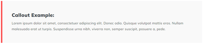
The Callout Box module is designed to help you highlight key information that might otherwise get lost in your page content. Unlike standard text modules, this component creates a visually distinct container that naturally draws the reader’s eye to important messages, quotes, statistics, or calls-to-action.
This module works particularly well on landing pages where you need to emphasize value propositions, blog posts where you want to highlight key takeaways, and service pages where important details or warnings need to stand out. You can also use multiple callout boxes on longer pages to break up text-heavy sections and improve readability.
Implementation Tips
When adding the Callout Box through HubSpot’s page editor, you’ll find it in your Spark Premium module library. The module accepts both plain text and rich text formatting, so you can include links, bold text, or simple lists within your callout content. The decorative border feature is particularly useful for brand consistency — you can position it on any side of the box and match it to your brand colors.
For optimal visual hierarchy, avoid placing callout boxes too close together on the same page, as this can diminish their impact. Instead, use them strategically to break up longer content sections or to emphasize your most important points. The two-column list option works especially well when you need to display comparison points or feature lists within the highlighted area.
The Dark Mode setting automatically adjusts text color for contrast, making this module versatile across different page designs and brand aesthetics. Consider using darker backgrounds for urgent information and lighter backgrounds for supplementary tips or quotes.