Feature Comparison Table
A table to compare features of different products or product levels.
View a live demo of this module.
Content
- Add as many rows as you need
- Set row to be a header row
- (If header row) Add heading and eyebrow text
- (If not header row) Select content type (FontAwesome icon, custom icon, text)
Styles
- Set Dark Mode
- Change icon color (only applicable to FontAwesome icons)
- Change alternating column background color
- Change eyebrow color
- Edit module spacing
Overview
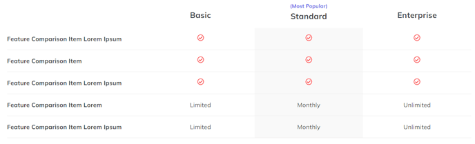
The Feature Comparison Table module is designed to help you showcase the differences between your product tiers, service packages, or competing solutions in a clear, scannable format. This module works particularly well on pricing pages, product detail pages, and dedicated comparison landing pages where prospects need to evaluate multiple options side-by-side.
When you drag this module into the HubSpot page editor, you’ll have complete control over both the structure and visual presentation. The flexible row system allows you to build comparisons of any size – whether you’re comparing two basic service tiers or conducting a comprehensive analysis across five different product versions.
Header rows serve as category dividers within your comparison, letting you group related features under descriptive headings like “Core Features” or “Advanced Tools.” The eyebrow text option adds an additional layer of context above each section heading, perfect for highlighting benefit categories or feature groupings.
For content rows, you can mix and match FontAwesome icons (great for simple yes/no comparisons), custom icons (ideal for branded elements), and text content (perfect for specific details like “Up to 1,000 contacts” or “24/7 phone support”). This flexibility means you can create comparisons that go beyond basic checkmarks to include detailed specifications.
The Dark Mode styling option automatically adapts your comparison table to match your site’s theme, while the alternating column background colors help visitors track information across rows. Since comparison tables often contain dense information, pay special attention to the module spacing controls to ensure your content remains readable on both desktop and mobile devices.
Consider placing this module early on conversion-focused pages, as it helps visitors quickly identify the option that best fits their needs rather than scrolling through lengthy feature descriptions.