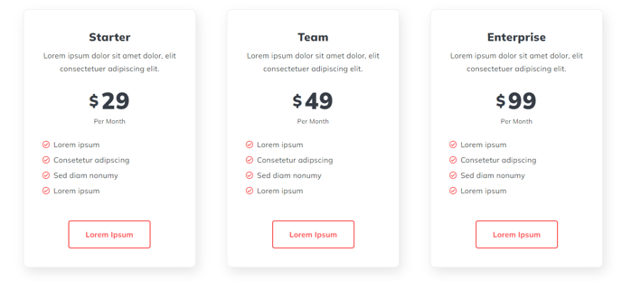
Pricing Boxes
Informational boxes for product/service pricing
View a live demo of this module.
Content
- Change how many boxes to show per row
- In each box include heading, price, additional info, and CTA
Styles
- Set Dark Mode
- Change list bullet style
- Split lists into two columns
- Change text alignment of heading, price, info, and CTA separately
- Change background color of pricing boxes
- Remove box shadow from pricing boxes
- Edit border styling of pricing boxes (width, radius, color)
- Edit module spacing
How to Use This Module
The Pricing Boxes module is designed to showcase your product or service pricing plans in a visually appealing, comparison-friendly format. This module works exceptionally well on dedicated pricing pages, service landing pages, and sales-focused website pages where you need to present multiple pricing tiers side-by-side.
When adding this module through the HubSpot page editor’s drag-and-drop interface, you’ll find it particularly effective for SaaS pricing tables, service package comparisons, or membership tier displays. The module’s flexible row configuration allows you to display anywhere from one to multiple pricing boxes per row, making it adaptable to both simple two-tier pricing and complex multi-option scenarios.
Best practices for content editors: Start by determining your optimal pricing box layout based on the number of plans you’re offering. For three pricing options, a single row works well on desktop, while four or more options might benefit from a two-row layout on smaller screens. The individual text alignment controls are particularly useful for creating visual hierarchy—consider center-aligning your main price while left-aligning detailed feature lists for better readability.
The Dark Mode styling option makes this module versatile across different page themes within your Spark Premium site. If your pricing page uses darker backgrounds or you’re creating a premium feel, Dark Mode ensures proper contrast and maintains brand consistency.
Pro tip: Use the border radius and shadow settings strategically. Removing shadows creates a cleaner, more modern appearance, while adding subtle borders can help differentiate pricing tiers. The two-column list feature is especially valuable when you have extensive feature lists, as it keeps your pricing boxes from becoming too tall and maintains better visual balance across your pricing comparison.