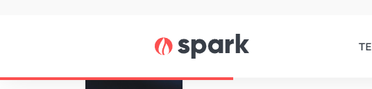
Progress Bar
Adds a bar below the header showing the scroll progress of the page.
View a live demo of this module.
Styles
- Change the height and color of the bar
Usage Guide
The Progress Bar module enhances user experience by providing a visual indicator of reading progress on content-heavy pages. As visitors scroll down your page, the bar gradually fills to show how much content they’ve consumed, encouraging them to continue reading to completion.
This module works exceptionally well on blog posts, case studies, and long-form landing pages where you want to keep readers engaged throughout lengthy content. The progress bar appears as a thin line below your site header and remains fixed in position as users scroll, making it always visible without interfering with your content.
To add the Progress Bar module to any page in your HubSpot account, simply drag it from the module library in the page editor and drop it anywhere on your page. The module will automatically position itself correctly below the header regardless of where you place it in the page structure.
Best practices for implementation:
- Use on pages with substantial scrollable content (typically 1,500+ words) where progress tracking adds value
- Consider your brand colors when customizing the bar color to maintain visual consistency
- Keep the height subtle (2-4px recommended) to avoid distracting from your main content
- Test the visibility against your header background, especially if using light colors
The Progress Bar module is particularly effective for educational content, whitepapers, and detailed service pages where you want to reduce bounce rates and encourage complete content consumption. Since it’s a lightweight addition that doesn’t impact page load speed, you can safely add it to multiple page templates without performance concerns.
This module automatically adapts to mobile devices, ensuring the progress indicator remains functional and visible across all screen sizes.