Tab Images
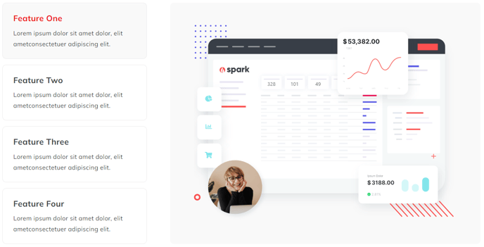
Images that can be clicked through using a tab list of captions.
View a live demo of this module.
Styles
- Set Dark Mode
- Change image panel background color
- Change tab active and inactive background colors
- Change tab border color
- Change image panel border radius
- Change tab border radius and width
- Edit module spacing
How to Use the Tab Images Module
The Tab Images module provides an interactive way to showcase multiple images with descriptive captions in a compact, organized layout. This module is perfect for before/after showcases, product galleries, feature comparisons, or case study visuals where you want visitors to actively engage with your content rather than passively scroll through images.
You’ll find this module particularly effective on service pages, product detail pages, and portfolio sections where visual storytelling drives conversions. The tabbed interface keeps users engaged longer on your page, which can positively impact your SEO performance and lead generation efforts.
Adding and Configuring the Module
To add the Tab Images module to any page, simply drag it from the module library in your HubSpot page editor onto your desired location. Once placed, you can upload your images and add corresponding tab labels through the module’s content settings. Each tab can hold a unique image with its own caption text.
Design Best Practices
When customizing the visual appearance, consider your brand colors and the surrounding page content. The dark mode option works exceptionally well on pages with darker color schemes or when you want to create visual contrast. The border radius settings allow you to match your site’s overall design aesthetic—use rounded corners for a modern feel or sharp edges for a more corporate appearance.
For optimal user experience, limit yourself to 3-6 tabs to avoid overwhelming visitors. Ensure your tab labels are concise but descriptive enough to give users clear expectations about each image’s content.