Tabs
Condense content with a tabbed list.
View a live demo of this module.
Content
- Add columns to each tab
- Make columns evenly sized or set a specific width
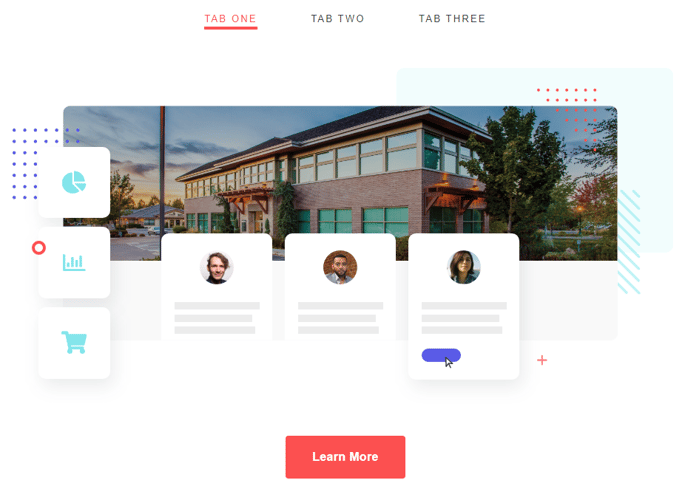
- Include text, CTAs, images, and/or forms
Styles
- Set Dark Mode
- Change text alignment
- Split lists into two columns
- Edit padding
How to Use This Module
The Tabs module helps you organize large amounts of content into an interactive, space-saving format that improves user experience on your HubSpot pages. Instead of forcing visitors to scroll through lengthy content blocks, you can present information in digestible tabs that users can click through at their own pace.
This module works particularly well on service pages where you need to explain multiple offerings, product pages with different feature sets, or FAQ sections where you want to categorize questions by topic. You’ll also find it valuable on landing pages where screen real estate is premium and you need to present comprehensive information without overwhelming visitors.
When adding the Tabs module through the HubSpot page editor, drag it into any flexible column on your page template. Each tab functions as a container where you can build custom layouts using the column system. This flexibility means you can create tabs with vastly different content structures — one tab might feature a simple text block with a CTA button, while another could include a multi-column layout with images, forms, and testimonials.
Pro tip: Use descriptive tab labels that clearly indicate what content users will find inside. Avoid generic labels like “Tab 1” or “More Info” in favor of specific terms like “Pricing Plans” or “Technical Specifications.”
The Dark Mode styling option ensures your tabs maintain visual consistency with your site’s overall design theme. When planning your tab content, consider the logical flow of information — place your most important or frequently accessed content in the first tab, as this will be visible by default when the page loads.
Remember to test your tabs on mobile devices, as the responsive design will adapt the layout for smaller screens while maintaining functionality.