Theme Form
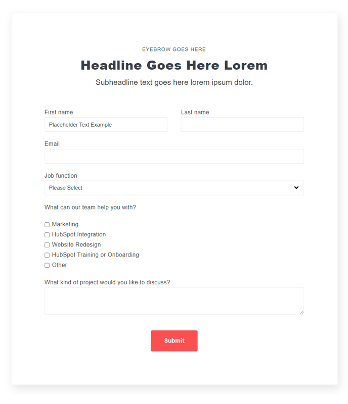
A form module with extra options not available in HubSpot's default module.
View a live demo of this module.
Content
- Include a heading
- Change heading alignment
- Choose to box in the form
- Choose label position (left, top, inset)
- Choose button position (left, center, right, full width, single field)
Styles
- Set Dark Mode
- Remove box shadow
- Change background color
- Change border styling (width, radius, color)
- Edit padding
Note: Edit the following global styles from your Theme Settings under the Forms section.
- Customize fonts for title, field labels, input text, help text, placeholder, and error text
- Change the field height
- Edit field and error background colors
- Edit field borders
- Edit boxed-in styling include background, border, and box shadow
- Edit dark mode colors
How to Use the Theme Form Module
The Theme Form module serves as a powerful replacement for HubSpot’s standard form module, giving you enhanced design control and layout flexibility that’s essential for maintaining brand consistency across your website. Unlike the default HubSpot form module, this enhanced version integrates seamlessly with your Spark Premium theme’s design system while offering advanced customization options.
You can add this module to any page type in your HubSpot CMS by dragging it from the module library in the page editor. It works particularly well on landing pages, contact pages, and service pages where form presentation directly impacts conversion rates. The module’s boxing and positioning options make it ideal for both standalone contact forms and inline newsletter signups within content sections.
Best practices for implementation: When using the inset label position, ensure your form fields have sufficient padding to maintain readability. The single field button position works exceptionally well for email signup forms, while the full width option is perfect for multi-step forms or when you want the call-to-action to dominate the visual hierarchy.
Take advantage of the global form styling in your Theme Settings to maintain consistency across all Theme Form modules on your site. This is particularly valuable if you’re managing multiple forms across different pages – you can update colors, typography, and spacing site-wide without editing each individual module.
The dark mode functionality automatically adapts to your site’s color scheme preferences, making this module versatile for both light and dark page designs. For optimal user experience, test your form styling across different devices, as the responsive behavior may vary depending on your chosen label and button positioning combinations.